NokiMo
LFØ
LFØ

patreon


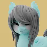
Which do you guys prefer?

I'm trying to update flowers mane to look more pretty.

Do you all prefer the original design (#1) or the new updated one (#2)?

(Unfortunately you have to download the pictures to see them if on PC)

Which do you guys prefer? Which do you guys prefer?

Comments

I enjoy 1 more. A natural girl(pony?) next door look. 2 is a bit more "I'm trying to look cute." I just prefer the cute without having to try style. Adds to the wholesome

Digi Rogue

Haha yeah

LFØ

#2 gives me the "Natural but still cared for beauty", while 1 is a bit more "Let it grow". Personally like 2 a bit more.

Delly

. While newer style has its good points. I’m still partial to her original, because it feels more natural in the way it rests on her head.

Crazedfox

I like each for different reasons, but maybe a mix between the 2 like if it was a shapekey having it be 50/50 old and new

Kie Dough

Combine a bit of the two together

NeonFoxJester

The new one shows her eyes more

LFØ

😆yes the posterior haha

LFØ

Which one let's us see her eyes more...???? "The eyes are the windows to the soul" they say...I still can't see the differences in pupil, being a sort of muddy grey, even with the yellow in the iris... I like her first version mane the most...but we definitely need to see her eyes much more..

David J Cerame

Well you're doing an amazing job so far. And I'm jealous on how soft and plush you make these models look. Especially in the... Ahem... Posterior, lol

Drag0nEmper0r

Yes she is!

LFØ

I fell in love with number 1 when I first saw her, so I prefer that one. Either way she's still our sweet Flower 😊

Yotta-Lyte

Haha yeah I try my best. If people are willing to support my work financially the least I can do is try to respond to any feedback they give me.

LFØ

Oh wow, didn't expect a reply that fast, you really are on top of this Patreon thing. Most Patreon creators are like phantoms you gotta summon in ritual sacrifice to even converse with at all.

Drag0nEmper0r

For sure. I’ll definitely work on that.

LFØ

I think number 2 is cuter while number 1 is a little shiftier. Number 1 could be up for stealing some cake.

PaperYoyo

If you mixed the curves and sway of version 2 with the asymmetrical layout of version 1, you'd have a perfect mane, but if I HAD to pick I'd go 2, I love the flow of it, adds to her roundness and cuteness more

Drag0nEmper0r

Both are beautiful looks for her. It was really close. You do good work.

Flyleaf Dreamleaf

I think 2 a little cuter

Gidget


Related Creators