BERNTH KHDK Signature Pedal Voting
Added 2022-08-18 14:30:01 +0000 UTC
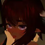
Which of these 2 designs do YOU prefer? :)
I'm excited to reveal what we've been working on for many months now: a killer KHDK BERNTH signature pedal that finally got me the fluid, crystal clear, but still powerful high-gain lead tone I was looking for ages!
The VIP community voted between 3 designs on Facebook yesterday and I adjusted one of the designs based on the input I got - but we can only pick one!
Can't wait to see how you decide - I will reveal more about the pedal as soon as we have a final design 🤘
Comments
2 looks so clean and gives off your vibe amazingly
Sam Rafael Garcia Jr
2022-09-06 14:48:13 +0000 UTC@bernth, when does the pedal come out?
Mark Sanders
2022-09-02 02:32:03 +0000 UTCWell... Both 😂 Alive or dead Upspin or Downspin #1 #2 All the same 🙃
Pasqual Vestner
2022-09-01 17:05:42 +0000 UTCI think that #2 matches your general aesthetic more.
Tristen Pearce
2022-09-01 13:08:25 +0000 UTC#1 is more original
Randall Melendez
2022-08-31 11:40:46 +0000 UTC1 is killer but 2 would look better on my board -my vote is 2
keith stutts
2022-08-25 23:03:23 +0000 UTC2 is more metal.
António Mota
2022-08-25 14:59:31 +0000 UTCless is more
Fabrizio Cernuda
2022-08-21 02:12:35 +0000 UTCwhat's the sounds like, this more important.
择一 李
2022-08-20 20:46:44 +0000 UTC2 has a mysterious look to it, nice.
Matthew R.W.
2022-08-20 14:01:06 +0000 UTC2 looks more professional I'm just concerned about the position of in out on top maybe great for modern pedal boards
nersonangelo
2022-08-19 23:07:01 +0000 UTCI like them both but I really like how clean 2 is.
Rob Lee
2022-08-19 17:09:02 +0000 UTCI have a preference for the 2.
Florent Gasselin
2022-08-19 07:57:00 +0000 UTCControls need to be easy to read. Especially in low light stge conditions. Both designs seem to lack this at the moment
Peter North
2022-08-19 01:48:33 +0000 UTCGuys , im doing Legato exerercises #227 , these are short vids .What if I want to go repeat to play along ? And should I aim 120 bpm starting with 40 up ? Or this is just a usefull lick ? Im new here...cause I wasted to much time in my life lol . Pls help !🤟👊Looking for good fret fingers workouts...im slow..
Patrycjusz Wlodyka
2022-08-18 23:02:41 +0000 UTCdo we get a discount being a member ha just messing. I will support you no matter what. Looking forward to trying this. 1 looks good but way to busy. I vote 2
Mike Geoff
2022-08-18 20:28:58 +0000 UTCActually I changed my mind after a screenshot and a zoom and went for 1 lol 🤘😂
Ivan V.
2022-08-18 20:13:37 +0000 UTCI just like black things... So I'm just biased 😅🤷
Ivan V.
2022-08-18 20:11:54 +0000 UTCNumber One is PERFECT!!
Neal G.
2022-08-18 20:04:10 +0000 UTC1 from me
stg stg
2022-08-18 19:52:32 +0000 UTCEvery pedal is black !, so 1 would be it for me. You have to be able to see what you adjust tho.
Dirk den Ouden
2022-08-18 19:26:00 +0000 UTC2! But, the initial number 2 in the vip group was better, imho.
Ronnie
2022-08-18 19:11:07 +0000 UTC2 but with volume in the middle. I have 2 other black pedals and I really like original artwork.
Andy Marshall
2022-08-18 19:06:32 +0000 UTCFire colour is the best, to much black everywhere, Prefer No. 1
Marcin Podlasinski
2022-08-18 19:02:24 +0000 UTC2 is cool, but if you could make the markers on the knobs easier to read that would be a huge improvement imo (like grey or white markers on the black knobs)
Peter S Dietrich
2022-08-18 18:40:59 +0000 UTCIf you can enhance the reading in the first one, ok. If these are finals, the second one is more functional. Note: I prefer the Volume in the middle for practical purposes.
Luis Lobo
2022-08-18 18:15:53 +0000 UTCNo. 1 is too busy in my opinion and the text is hard to read. No. 2 is more minimal and cleaner with more contrast between the background and text making it easier to read. No. 2 gets my vote
Hlynur Stefánsson
2022-08-18 18:00:16 +0000 UTC1 nicer and would stand out more
Alberto Rattazzi
2022-08-18 17:24:54 +0000 UTCLooking forward to hear it \m/
Rune Hansen
2022-08-18 16:56:54 +0000 UTC2 should be production, 1 should be a “limited first run”
Brad
2022-08-18 16:40:07 +0000 UTC1 I have a couple of pedals that look just like 2 in my collection.
Henry C
2022-08-18 16:32:18 +0000 UTC1 would be easier to find among a pile of other metal pedals
DD SVH
2022-08-18 16:30:19 +0000 UTCI went with 2. Mostly for practical reasons since it's easier to read. But I do prefer the understated art.
Rich
2022-08-18 16:27:06 +0000 UTCI prefer the look of 1 but I voted for 2 because 1 is almost too busy for the size and I have to agree with several of the comments about 2 being much more timeless of a look.
Sean Bender
2022-08-18 16:19:09 +0000 UTCI would need to hear it: 1 is like a blaster triggering earthquakes, for unbelievably massive riffs and face-melting solos etc. 2 is for dark, melodious, bass and mid-focused sounds.
Mark Llewellyn
2022-08-18 16:04:22 +0000 UTCI can see myself getting bored of the design of number 1 after a while, 2 looks more timeless. It also looks like something that would fit right in on my pedalboard
Mirdjan Hyle
2022-08-18 15:54:30 +0000 UTCDecided on 2, even though 1 is awesome, too. 2 will be taken more seriously, I believe.
Michael Latham
2022-08-18 15:52:31 +0000 UTC1. 2 is boring.
John W. Daly
2022-08-18 15:24:37 +0000 UTCEither design as both are really cool, 1 really is your colors though. Just happy you're getting your own pedal, well deserving and will probably kick ass :)
Snir Kadosh
2022-08-18 15:22:26 +0000 UTC2
Michael
2022-08-18 15:21:15 +0000 UTC2
Vincenzo
2022-08-18 15:15:20 +0000 UTCNo. 2 is a killer.
Evan
2022-08-18 15:10:58 +0000 UTCI voted for #2 though I appreciate #1’s nod to crawling skull void.
Jim MacDonald
2022-08-18 15:10:43 +0000 UTCI'll just tell my wife I'm spending money on another girl. She'll be less annoyed than me buying another pedal 😂
Mark Lucas
2022-08-18 15:08:55 +0000 UTCDefinitely the first one.
Jay
2022-08-18 15:05:23 +0000 UTCBei Pedal 2 kann man den Schädel nur schwer erkennen. Vielleicht sollte hier der Kontrast etwas höher sein!? Habe mich nun für Pedal 1 entschieden.
FatManNoodlin'
2022-08-18 15:01:58 +0000 UTCI kinda preferred the original #3 you showed over this version, but it's still freakin awesome!
John Jackson
2022-08-18 14:54:50 +0000 UTCSorry, but 2 is boring.
Karsten Fliegner
2022-08-18 14:54:10 +0000 UTCI freaking loooove the motive and the colors on 1. so i voted for it. The knobs within the eyes and the nose are killer! But for a crystal clear high gain pedal, 2 would fit better. I would have some problems to adjust the knobs because the markers have the same color as the knobs. But hey... order different ones or paint them who don't like it.
x2x x3x
2022-08-18 14:52:48 +0000 UTCDang it I really wanted the H.R. Giger one!
Harbinger
2022-08-18 14:50:35 +0000 UTCDamn dude... Could you make it any harder?
Michael Marshall
2022-08-18 14:50:00 +0000 UTCNumber 1 is your color. I think there's too much pedal with the black and yellow patterns. Go with the one that represent yourself
Philippe Fortin-Guévin
2022-08-18 14:48:04 +0000 UTCAs much as I enjoy both, I think Option 2 is much easier to read the fonts and I think its colour scheme matches your Youtube channel/branding, so it's more Bernth to me. That being said #takemymoney
Eric Bailey
2022-08-18 14:43:56 +0000 UTC2. But it's hard to actually see what it's supposed to be. Which it also was on the first design. I would not relate this to Giger if you hadn't written that before.
Arvid Richter
2022-08-18 14:42:39 +0000 UTCI like number 1, it’s your colors
Harald
2022-08-18 14:39:47 +0000 UTCCant wait to buy one, no matter what it looks like... Lol
Zachary Bryce
2022-08-18 14:38:32 +0000 UTCIs this designed for high gain pickups?
Barry Orlando
2022-08-18 14:35:06 +0000 UTCSecond is berther
Odysseas Pierides
2022-08-18 14:33:08 +0000 UTCWill this be released as a VST plugin as well?
David S.
2022-08-18 14:32:57 +0000 UTC