Thought I'd do a little walkthrough of my typical process for scenes like this...
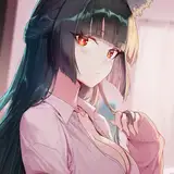
First step is to always get your head straight for what you want your colors/ panel to communicate. This will depend on a lot of stuff, such as personal style, your comic's defined style (for example I don't use things like speedlines or emotional textures on TM so those are non-options), etc. You'll also want to figure out what you want to push in a technical way, and plan for it... for example, I have two lighting sources that I'm using to varying degrees in this scene, and I'd prefer when possible for them to make sense and also to look nice and help tell the story.
Next is technical stuff. I tend to color/ light my work the way you would see it lit irl. For example, you're wearing a red shirt. But, you're standing in a blue room at dusk. Maybe then the shirt looks more magenta or purple. The red is called the "local color" but the actual color may be different depending on your environment. You can make a style sheet for yourself with the local colors of all of your characters/ important props, and apply blending modes (or hand paint if you're not cheap like me) to estimate what they'd look like in a variety of environments or times of day such as... golden hour, dusk, morning, in a big bright room, in a dusty attic, whatever. That's pretty much what my flats layer represents here... a glom of both the local coloring and the environment colors. Then, as in real life, I subject the object to some light effects. In this case I have my bright orange fire color which is casting a halo (an outer glow layer on low opacity can help with this) and also the moonlight coming straight down from above, which is casting a sky blue color on the dark. A scene with two conflicting parties works really well with dramatic lighting, or one where the contrasts are high (in this case, bright v dark and blue v orange) .
The type of layers and etc I use aren't really important, those change from scene to scene; the only thing I really care about is that the colors stay consistent in a scene where I need them over and over. Then I will do the last step shown in the coloring, which is to go and do a human paintover in certain areas because having exactly the same colors over and over is boring to all of us. It's a personal choice, but for me, I enjoy comics or film where the color fluctuates to match the mood and even just to break up the monotony (when it works! not just for no reason).
Anyways I can see some stuff I hate with this panel already, haha, that's generally how it works, but I thought some of you might find this type of approach interesting :] If we ever reach the tutorial reward level of patronage, I'll explain all of this stuff in a more specific way with some quantifiable layers, modes, percentages/ ratios, etc.
Javier Dehesa
2016-01-25 23:56:57 +0000 UTCDer-shing Helmer
2016-01-25 18:19:03 +0000 UTCJavier Dehesa
2016-01-25 12:54:28 +0000 UTCOfeila E
2016-01-24 10:01:47 +0000 UTCDer-shing Helmer
2016-01-22 21:15:09 +0000 UTCDuke BG
2016-01-22 20:01:07 +0000 UTCOfeila E
2016-01-22 10:17:56 +0000 UTC