NokiMo
AmorousDezign
AmorousDezign

patreon


Cataclyzm Title

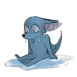
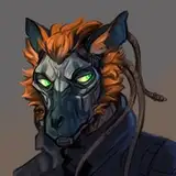
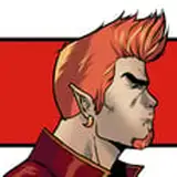
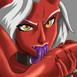
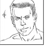
Trying out some new Title fonts and artwork. Which one do you like most?

Cataclyzm Title Cataclyzm Title Cataclyzm Title Cataclyzm Title

Comments

The second up right is the best it does justice for u and the game it self πŸ’― πŸ™ŒπŸΌ πŸ‘ŒπŸΌ πŸ’ͺ🏼 πŸ™πŸΌ πŸ‘πŸΌ and the 4th is good also πŸ‘ŒπŸΌ πŸ‘πŸΌ πŸ˜‰

NatureOfLove86

They all look good. I like the top right one since it's closer to the games dynamic

jon Davis

With the skull it is a eye-catcher and the letters are perfect πŸ‘imao . The other are good too, of course, so i am satisfied with each of the title is it.

Skeeve

2

Lucian Ovidiu ladaru

1 for me I like how simple it is compared to the others and in general I like the style of the letters better

Daniel Gutierrez

My preference would be for option 2 or 4. 3 isn't bad, but it feels more appropriate for a comparatively darker setting than Cataclyzm. 1 is an example of simplicity proving that less can be more and does look good, but I still have a preference for 2 and 4 when compared to 1.

L30

The third (with the skull) would be too meta. I think two or four are great but since Miles has such an important role, by changing the future quite hard, I think adding a scale with two hearts (one for the humans, the other for the beasts) would look very good.

SirMalo

I like the clean simplicity of the first option! The fourth being a close second.

Cody B

Honestly ether two or four both look good

Joseph Matuska

I really like number 2 and 3 but if I have to pick I pick number 2. Number 2 I get a more game of throne vide. Number 3 I get more a Warhammer 40k vide.

AzureWolf

Number 3

Michael Hegge

I say number 4 is better.

WolfNinja

1 is pretty slick, but I'm in favour of 2

Sksk4128

The first one is minimalist while still purveying that there's darkness in the world.

WΓΌlfie-kun


Related Creators