Art Comparison Poll, Deciding a Style (and Announcement!)
Added 2019-11-14 22:00:07 +0000 UTC
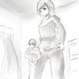
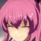
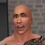
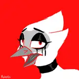
We are currently working on finalizing the game's artistic style, and here's 55 to show it off.
On the left is a thin-lined higher gloss version, in the middle is a thicker-lined heavier shadowed version. In both versions the lines are the same color as the object (as opposed to a black outline). On the right is a black-lined version with the heavier shading.
Which one looks best to you? Vote! VOTE DAMN YOU!
Voting is considered concluded as of the 24th, as Chicken will need to go into production using this template. We will then spend a few months getting the entirety of the game's art up to this code.
Also, I have finished the credits sequence and it contains a special thank-you for all patrons with a lifetime total over 100$. I will be sending messages you asking if you would like to NOT appear in the credits for whatever reason. Please let me know ASAP. If you don't answer before the prototype goes public you will be included by default.
Comments
Same. For me the leftmost is nice to look at, briefly, but it kinda makes my eyes hurt over time; I think the lack of clean edges messes with my focus a bit.
Tenmachi
2019-11-15 12:04:11 +0000 UTCI like how smooth left one is, but the right one is just easier on the eyes in every sense of the word.
tipoima
2019-11-15 04:28:54 +0000 UTCAccording to Chicken, the black lines also take less time because no color selection is needed. So if there's a tie, we're going with that one.
SaltyJustice
2019-11-15 01:30:36 +0000 UTCI lean toward the thicker options, though I think thin lines might work better if the colors were more vibrant - higher saturation and contrast, maybe. If you go with rightmost, make sure to include onomatopoeia (BIFF! THWAP!).
xyzzyzzyxxysym
2019-11-15 01:24:06 +0000 UTC