※English version 🔽🔽🔽
絵の描き方についてこれまで何度か質問を頂いていたので、私の塗り方について説明したものを記事に残します。
大前提、絵に正解はないし、プロでも制作過程は人の数だけあります。
これは、あくまで私個人が塗り作業をするときに考えてる事を紹介するものです。
まず、私はモノを描写するにあたり『造形』『色彩』『効果』の3つの要素を考えています。
--------------------------------------------
●造形
…まず、単色の濃淡のみで表面の立体感を表現する
1.大きい陰
2.細かい陰
3.影
●色彩
…次に、モノの特性や環境光による色彩を描く
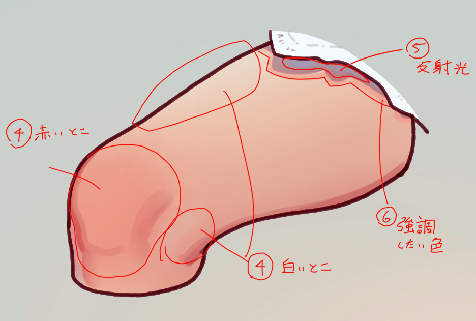
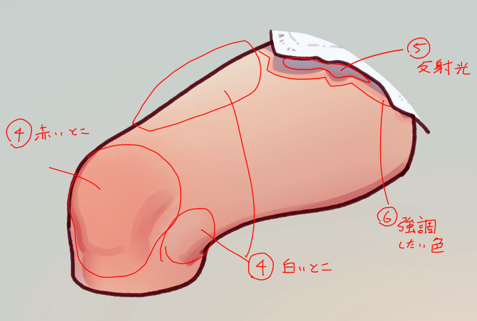
4.色むら(肌の赤み、白身)
5.反射光
6.強調したい色
●効果
…最後に、存在感と説得力を与える
7.質感
8.遠近感
9.輪郭強調
--------------------------------------------
ひとつずつ説明します。
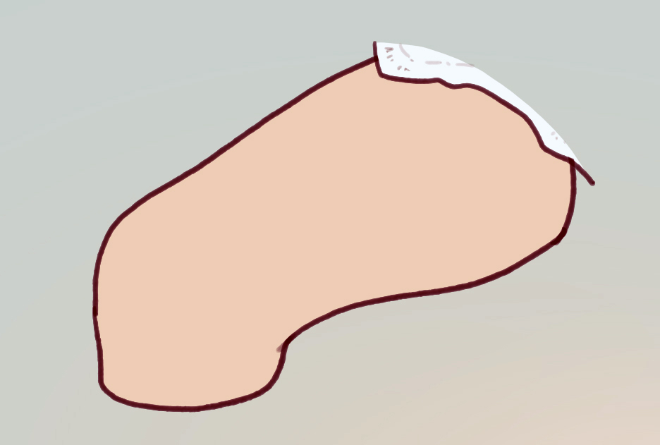
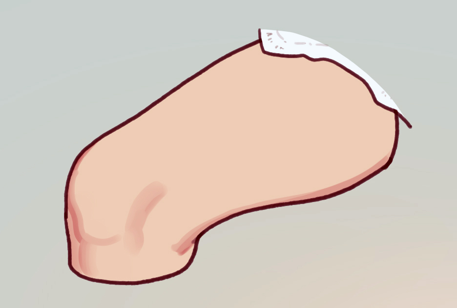
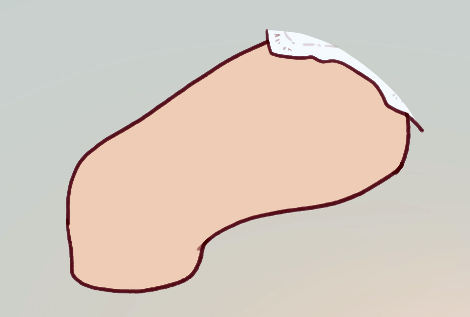
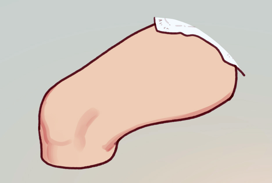
まずはこちらをご覧ください。
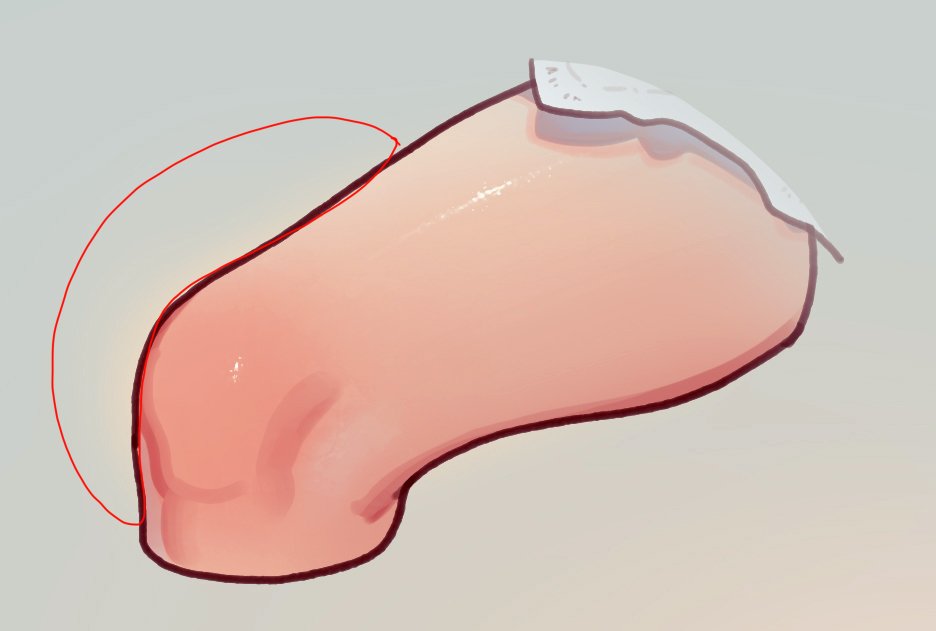
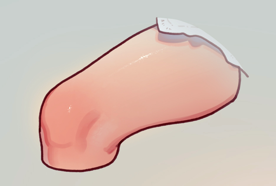
ここに、ふとももっぽい何かがあります。
まずは、単色の濃淡のみで表面に立体感を与えます。
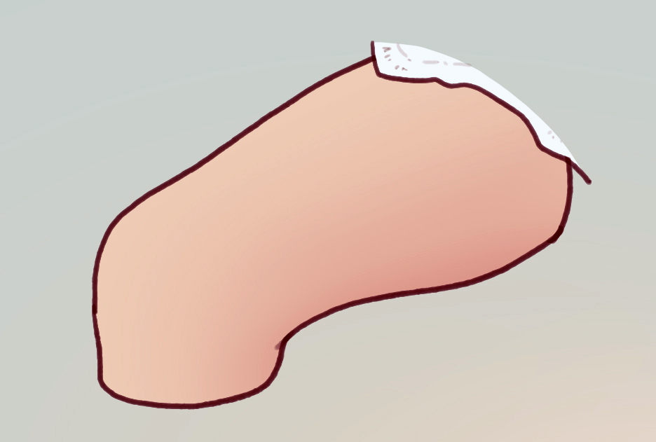
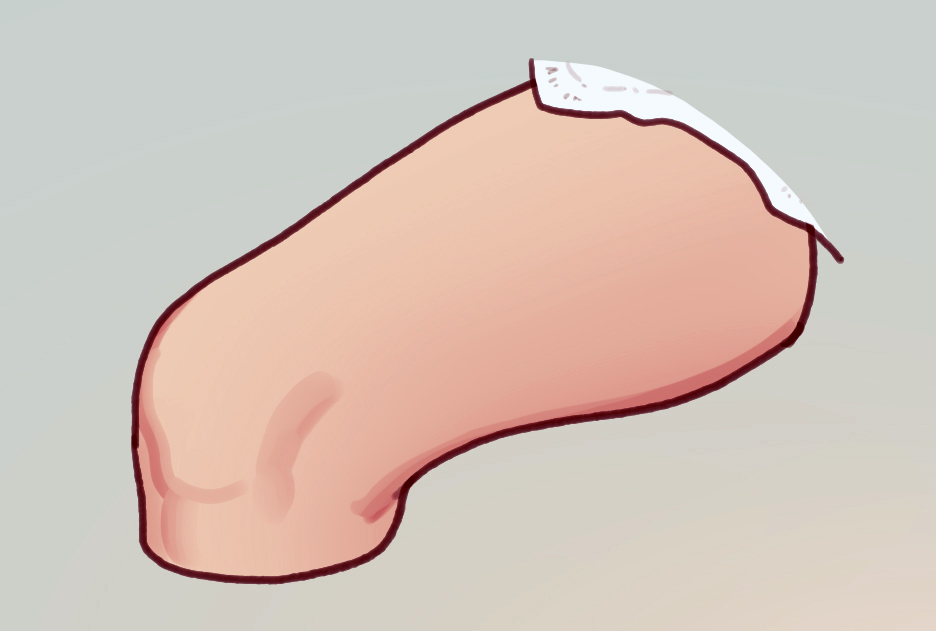
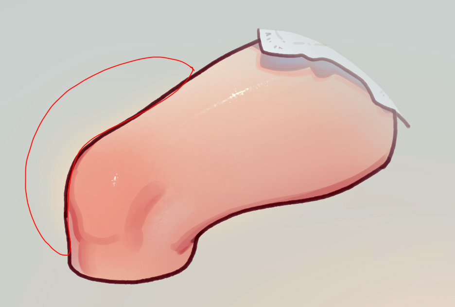
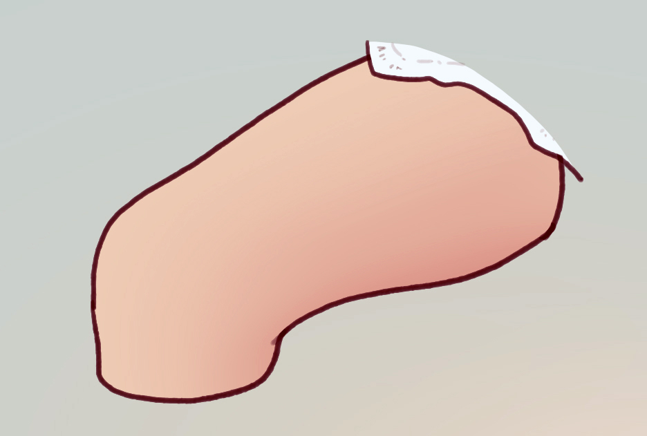
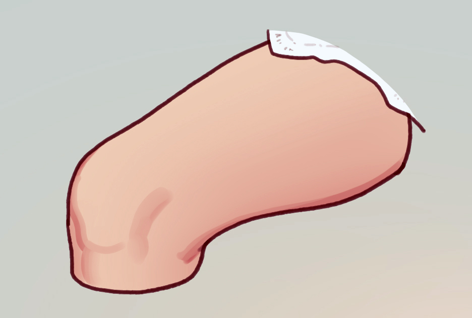
1.大きい陰
輪郭の柔らかい筆で全体にグラデーションをかけます。
今回の場合、ざっくり円筒と捉えています。
2.細かい陰
表面の凹凸や、輪郭付近の陰を描きます。
私の場合、硬い輪郭の筆をメインに、表現したい立体感の柔らかさに合わせて適宜筆の輪郭を変えながら作業してます。
ふたつを重ねるとこうなります。
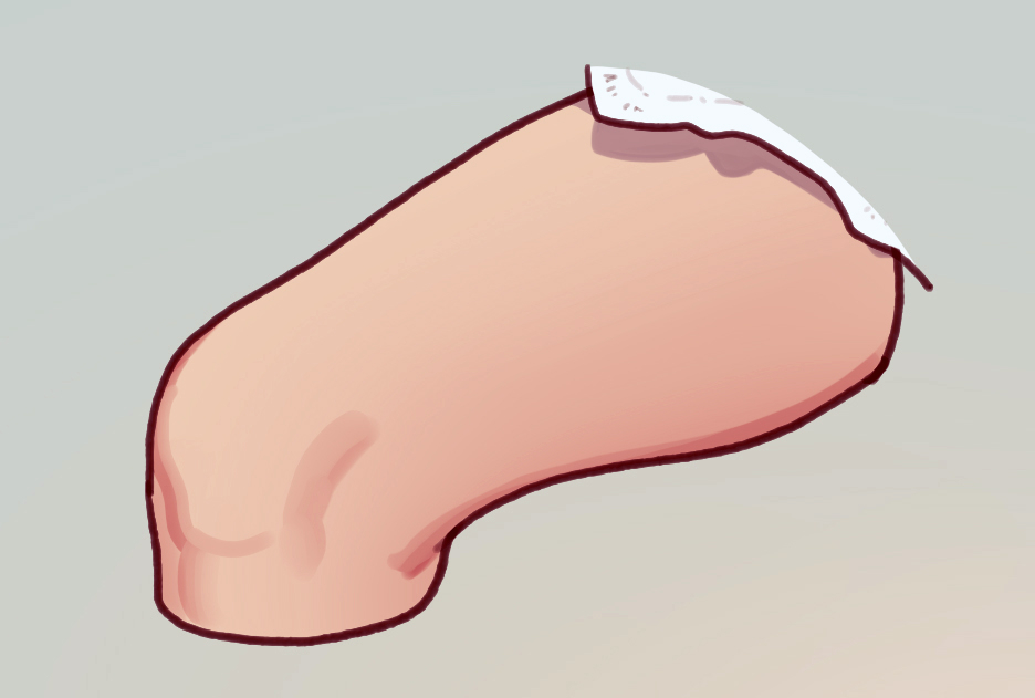
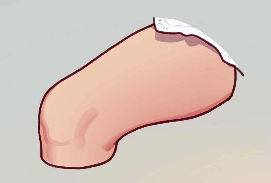
3.影
次に、光がモノに遮られてできる影を描きます。今回はレースの裾の影です。
これで、濃淡による造形は完了です。
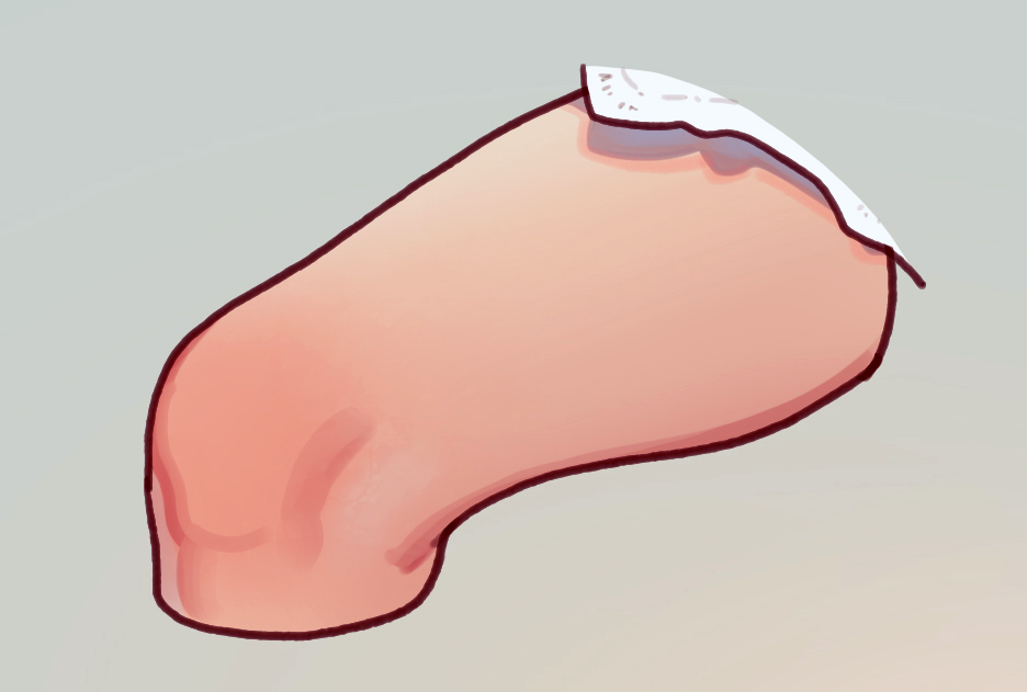
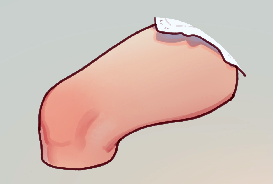
ここから、対象のもつ特性や周囲の環境光による色彩を考えます。
4.色むら(肌の赤み、白み)
人間の肌であれば、赤いとこ、白いとこがありますし、単一色の無機物であっても様々な色の揺れがあります。
5.反射光
今回は、影の中を青っぽく塗ることで、白い衣服の裏地が肌に照り返してるのを表現しました。
6.強調したい色
現実でも、影の輪郭に別の色が見えることがあります。
この状況で影の周囲がこんなに赤くなるか知りませんが、いい感じになるのでよく入れます。
他にも、影の輪郭に限らず、あるといいなと思った色は自由に乗せるようにしてます。
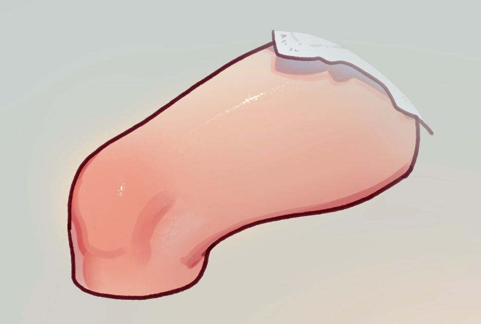
最後に、存在感と説得力を与えるのに役立つ効果を考えます。
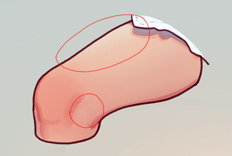
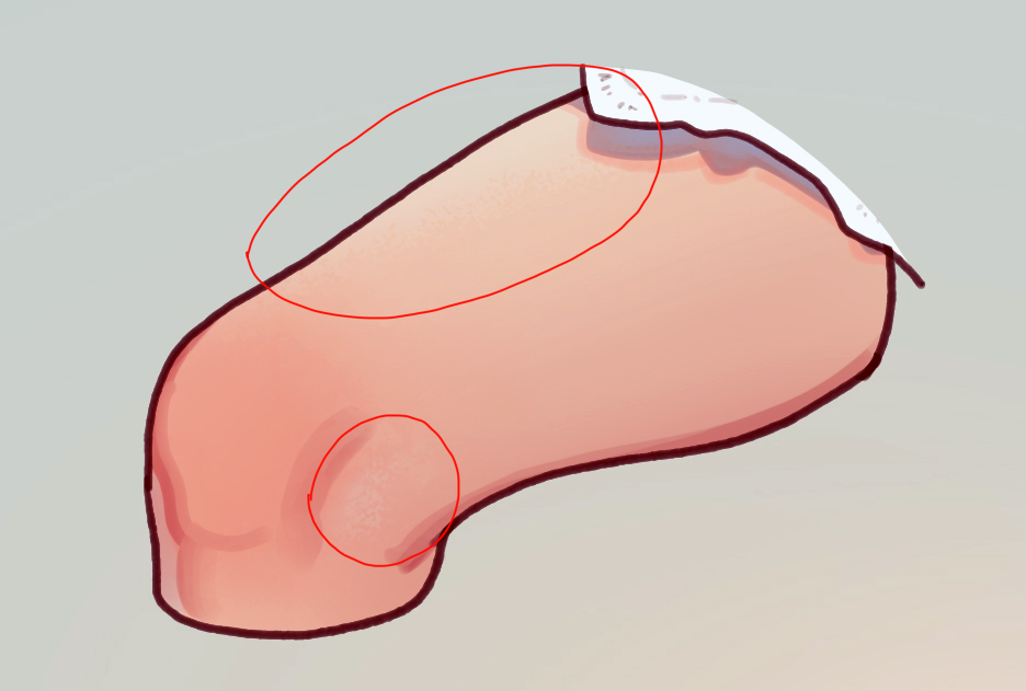
7.質感
たとえば、形状にテクスチャを付与した消しゴムで『4.色むら』を削ったり。
粒感あるハイライトを入れて表面のキメを表現したり。
他にも、対象全体にテクスチャレイヤーを重ねたりと方法は様々ですが、押さえておくと良いのは
・光が横からあたるとこ(物体の輪郭付近や、明るいとこと暗いとこの境目)
・光を鏡面反射すること(この絵でいうとハイライト)
に表面の凹凸は出やすいということです。
まんべんなくテクスチャを施しすぎると、ただ汚くなることもあるので注意。
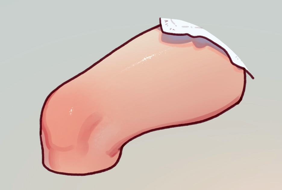
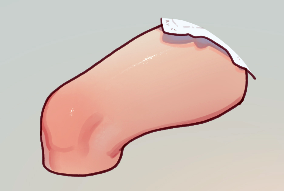
8.遠近感
背景の色をスポイトしてグラデーションをかけると、背景に(遠景に)溶けていくような効果を生みます。
これを使って、距離感や前後関係の強調を行います。
このふとももがどこから来てどこへ向かうのかは知りません。
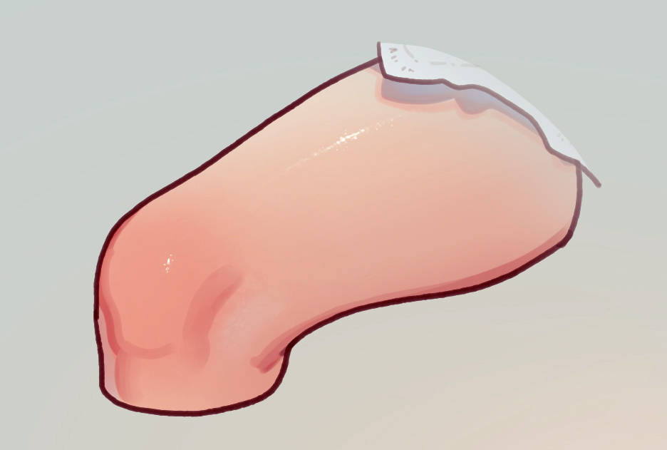
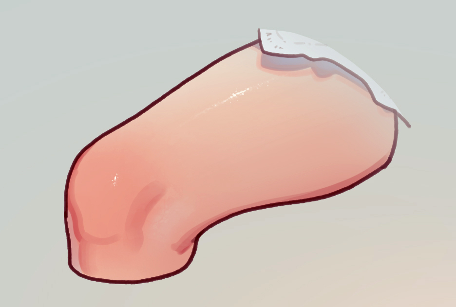
9.輪郭強調
対象の周囲に柔らかいグラデーションをかけると、対象の輪郭が強調されて存在感が増したり、絵全体が何やらいい感じになったります。
グラデーションに使う色は、背景の対の色(黒なら白、青なら黄など)や、対象の色(今回なら肌色)が効果的です。
以上。
はじめはあんなにふとももっぽい何かだったものが、見事ふとももっぽい何かになりましたね。
私が塗りで考えてる要素の紹介でした。
質問や詳しく聞きたい点があれば、ぜひコメント欄にお寄せください。感想だけでももちろん嬉しい。
基本すべてに返信しますし、気分がのったらまた画像付きで紹介します。
皆さんがどこに興味を持ってて何を聞きたいのか、案外私わかってないので、具体的に頂けると助かります。
=======
Since I’ve received several questions about how I paint, I decided to write an article explaining my coloring process.
First and foremost: there’s no ”right” way to make art, and even among professionals, the process varies from person to person.
What I’ll share here is simply my personal approach—what I think about when I paint.
When depicting an object, I consider three main elements: form, color, and effects.
--------------------------------------------
●Form
...First, I use only shades of a single color to create a sense of three-dimensionality on the surface.
1.Large shadows
2.Fine shadows
3.Cast shadows
●Color
...Next, I add colors that reflect the object’s characteristics and surrounding light.
4. Color variation (such as redness or paleness of skin)
5. Reflected light
6. Emphasized color
●Effects
...Lastly, I add effects that give the piece presence and a sense of realism.
7. Texture
8. Depth/perspective
9. Contour emphasis
--------------------------------------------
Let’s go through each of these one by one.
First, take a look at this:
Here we have... something vaguely thigh-like.
I start by giving the surface a sense of volume using only a single base color with light and dark values.
1. Large shadows
Using a soft-edged brush, I apply a general gradient across the entire object.
In this case, I loosely imagine the form as a cylinder.
2. Fine shadows
I add shadows around the small bumps and edges of the surface.
Personally, I mostly use a hard-edged brush for this, and switch to softer ones as needed depending on the kind of form I want to suggest.
When you combine steps 1 and 2, it looks like this:
3. Cast shadows
Next, I paint the shadow cast by another object blocking the light. In this case, it's the shadow of the lace hem.
With this, the form is fully rendered using shading alone.
From here, I start thinking about the object's inherent color and the effect of environmental lighting.
4. Color variation (redness, paleness, etc.)
Human skin has red and pale areas, and even inorganic materials with a single base color tend to show subtle shifts in tone.
5. Reflected light
In this case, I added a bluish tint in the shadows to show light bouncing off the underside of white clothing and onto the skin.
6. Colors I want to emphasize
In real life, you can sometimes see other colors along the edges of shadows.
Whether or not the shadow would actually be this red in this situation—I don’t know. But it looks good, so I often add it.
This also applies more generally—I freely add whatever color I feel would enhance the image, not just to the edges of shadows.
Finally, I add some effects to help the image feel more convincing and “present.”
7. Texture
For example, using an eraser with a textured shape, I can remove some of the earlier color variation to create texture.
Or, I can add speckled highlights to suggest skin pores.
Other techniques include adding a texture overlay across the whole object.
What’s important to keep in mind is that:
・Texture tends to be more visible where light hits from the side (around edges or transitions between light and dark)
・Texture also shows up clearly in areas of specular reflection (like highlights in this example)
If you apply texture too uniformly, it can just make things look dirty—so use with care.
8. Depth / Perspective
By sampling a color from the background and blending it as a gradient, I can create an effect where the object seems to fade into the distance. This helps emphasize a sense of spatial depth or separation.
Though frankly, I have no idea where this thigh came from or where it's headed.
9. Emphasizing contours
Adding a soft gradient around the object’s outline makes it pop more and gives the whole image a more “finished” feel.
Good colors for this include the complementary color of the background (e.g., white against black, yellow against blue), or something matching the object itself (in this case, skin tone).
And that’s it.
What started off as something vaguely thigh-like has now successfully become... something vaguely thigh-like.
That was an overview of the things I think about when painting.
If you have any questions or want to know more about a specific point, feel free to leave a comment!
Even just your thoughts are very welcome.
I usually reply to everything, and if I’m in the mood, I might post more explanations with images.
To be honest, I’m not always sure what people are curious about—so it really helps if you’re specific.
MUK(むっく)
2025-06-10 08:50:27 +0000 UTCMUK(むっく)
2025-06-10 08:49:13 +0000 UTCMUK(むっく)
2025-06-10 08:49:04 +0000 UTCMUK(むっく)
2025-06-10 08:48:51 +0000 UTCMUK(むっく)
2025-06-10 08:38:29 +0000 UTCMUK(むっく)
2025-06-10 08:38:21 +0000 UTCMUK(むっく)
2025-06-10 08:38:03 +0000 UTCNick
2025-06-08 09:58:39 +0000 UTCナビ・イマキュレート
2025-06-08 05:41:20 +0000 UTCKitsu-Juanxo-San
2025-06-07 17:19:25 +0000 UTCScrooge
2025-06-07 16:48:32 +0000 UTCEmitX
2025-06-07 02:26:41 +0000 UTCNajuCaju
2025-06-06 16:06:53 +0000 UTCお髭の獅子舞
2025-06-06 12:23:16 +0000 UTC