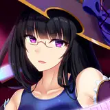
Freya Scene WIP - The difference between using reference and copying
Added 2024-05-30 16:00:07 +0000 UTCFor this WIP post, I wanted to talk a bit about how to actually use reference, rather than just copying a picture. If you're just here for the WIP sketch, here it is.
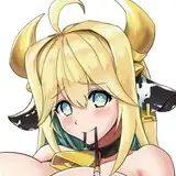
 Now for this scene, I used one of my favorite animator's scenes for reference. Using their animations as reference usually requires a bit more work for me to translate into the Waifu Wonderland style, since his models are generally more realistically proportioned, but I like their camera angles and they tend to do some more unique poses, like this one.
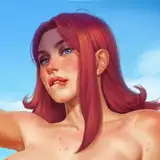
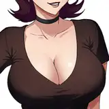
For comparison, this is the reference captured from one of their Jihl animations.
 When using a reference, it's important to keep in mind that's just that, a reference. You don't have to follow it exactly, it's just there to give you a starting point. If you follow the reference to closely, or just straight up trace it, it's likely going to end up looking a little weird and off.
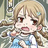
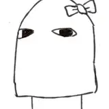
Here's an example of what I mean. I don't have the original reference anymore, but this is a CG that I made for the very first game I ever tried to make, called Fan Fantasy. That was about 15 years ago. I was a truly terrible artist back then, and thought I'd be able to cheat by just tracing a picture. Anyway, this was the result.

Since I just traced the reference, there's no real style here. It looks a bit stiff and off. The nose is the most obvious part. I just traced it, and it came out looking flat and unnatural. The eyes too. They look a little uneven and weird, because in real life, eyes are uneven and don't actually perfectly line up. The body in general is very asymmetrical and it doesn't look right when you try to translate it into a stylized 2D space. Then there's the shoulder. Since I just traced it and had no understanding of what I was doing, it looks really weird. I put lines where there really shouldn't be. It's also extremely obvious which parts I added. Like the bangs and side parts of the hair. They're all weirdly blocky. It doesn't look like hair at all. It doesn't help that the back is more like real hair, which probably means that part was traced. Overall, I had no real understanding of what I was doing. I just followed the lines, and that doesn't work.
Let's compare that to the Freya scene.
In the Freya scene, I tried to be accurate in some parts, but I knew what information to keep and what to exclude, and how to change the parts that needed changing.
For example, her back arm. In the reference, you can see the back arm right next to the penis. Including that line made that area a bit messy and confusing though. So I just took it out. It's not really needed. It's just barely there and you can really only tell that it's her arm if you look very closely. Even then, it's possible to just not know what it is if you don't have a grasp of anatomy. Another part I changed was where her ribcage and arm meet. Since I was using a 3D animation as a reference, the model kind of clips through in that area, instead of naturally pressing together. It works perfectly fine, especially when moving. No one is ever going to notice something like that on a 3D model, because it's done so much that our brains just kind of filter it out. So when translating it into 2D, I had to make the line between them look a bit more natural.
On the opposite side of this, you do have to be careful when taking information away. You don't want the piece to feel like it's missing something. That's why if you look on the bottom left, you can still see the guy's toes. Even though they're just barely there, when I tried taking them out, it didn't look right. I may even need to add more information there to make it clearer. Since they're just barely there, it might confuse people as to what it is, so I may need to sort of turn the foot more on it's side and add a little bit more. I'm waiting until I start doing the coloring though. I'm thinking that the difference in color may be enough.
Another big thing to keep in mind when using reference is what information needs to be lines and what needs to be shading. For example, if you look at the Jihl reference, her breasts are a lot more defined than how they're shown in the sketch. That's because if I used hard lines for the entire shape, it wouldn't look right. It needs a more subtle line. There's two main ways to do this, and it depends on the art style. One is to have different line widths. This is usually referred to as "line weight". Basically the thicker the line, the more solid the edge, and the thinner it gets the more subtle the line will be. Western comics use this kind of style a lot. The second is to use shading to create an implied line. That's what I'm going to be doing. In the WW style, I generally only use one size line. I sometimes vary it slightly to get more pointed edges (I did that for Freya's hair), or I'll make it a lighter color (which is another technique used to create different line weights, which I used for under her left breast), but for the most part, they're all the same thickness. In large part to save time. I'll talk a bit more about that some other time though. So instead, when I render, I'll use various techniques to use the coloring to create these more subtle lines.
These design choices need to be kept in mind when creating linework. And if you're just copying a picture or just tracing without thinking, then it's not going to turn out right.
Then the last thing I want to touch on is when to know what to change from the reference.
Unfortunately, this is something that's going to vary depending on the style and what you're trying to make. Which you can only really figure out through experience. So I can't say exactly what to do here. I'll talk about what I do though.
The biggest thing that needed to be changed here is the head and neck. Anime style generally has bigger eyes, a simple nose, bigger heads, and then smaller necks. For the WW style, depending on the character, I'll also exaggerate the breasts and butt. This reference was a lot more realistic than the WW style, so I had to change the head quite a bit. I wanted to overall keep the expression though. What tends to work for me, is that I'll do the base head shape accurate to the reference, then I'll use the liquify tool to mess with it until it's closer to the right size. Then I'll redraw it to fix the parts that liquify messed up. That's when I'll do the neck. That part's usually pretty easy. It's just taking a little bit off of both sides. It's especially easy using a ref like this, because I could use the clavicles to make a hard line. That way I don't have to worry about making sure it gradually moves into the shoulders. From there, I'll start doing the eyes, which is always by far the hardest part. I had a lot of issues with translating those when I first started working on WW. That's why some of the older scenes look a little off or not quite like the character (the worst being Seika's, and I am absolutely going to redo it eventually). I think I've gotten much better at it now though. It's one of those things that you just have to kind of feel out through trial and error. You can also find secondary references for the specific part you're trying to translate too. I still do that when needed as well. My primary artist inspirations for the WW style are Shigenori Soejima and an artist who's name I don't know because I don't know Japanese yet (I'm working on it though). They primarily make CG for games by a company named Atelier Kaguya, and it's primarily the work they did on the "x Holic" games I used as inspiration. Mostly Mama x Holic. So when I need a reference for how something like eyes or a nose should look, I generally look at one of those artists' work. If you look them up, I'm sure the influence will be very obvious. Like mentioned in the last WIP, I always have the character CG right next to the scene CG when working on it to help make sure it translates and looks like the same character.
One of the biggest sort of "secrets" to being a good artist, is that it requires a lot of thought and planning. If you want to be a good artist, you have to plan things out and be thinking things through every step of the way. This is one of the harder lessons I had to learn. I always thought art was more just about having fun and just doing how things feel, and that's true of certain kinds of art for sure, but not professional level art. Especially not things like character art. You've always got to keep in mind how the composition will look, if you're using a more direct reference how the character design will influence the composition, which parts are needed and what aren't, which parts need to be changed and how so, which parts should have what kinds of line weights, and how everything is going to look after rendering. It's a lot. Like anything, it does get easier the more you do it though! Once you've done something a lot, you can just do it without having to think quite as much. Your decision making will also go a lot faster and become more like second nature. It's a lot of work to get there, but once you do, it can be very rewarding looking at something and being proud of it. Even more rewarding if other people like it too.
I'll probably make another post rambling about the full process one day, or at least more about another step, but that's all for now. That's the basics on how to use reference rather than just copy a picture. It's a lot of decision making and a lot of trial and error. Hopefully that helped. Or at the very least, I hope you enjoyed the sketch and look forward to Freya's completed scene. If you have any questions, feel free to comment and I'll do my best to answer.