I was super honored to illustrate this year's Free Comic Book Day "Stranger Things" issue for Dark Horse comics. I actually got the gig when the editor found my work on Society6, which really illustrates the importance of showing and getting your work out there. You never know who might be looking. Maybe I should make a post about social media?(Spoiler alert: just post your work everywhere.)
I'm digressing, let's get back to the drawing.
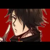
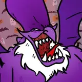
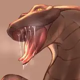
The editor came to me about the cover needing to be eye catching and evocative, which is an obvious factor when it comes to promotional work especially cover work. I was especially ecstatic when told about the property I was working with, am a big fan of Stranger Things. All they knew was they wanted to incorporate the creature(The Demogorgon), the rest was up to me to decide. Definitely a dream job in terms of subject matter and direction.
From there I made a series of sketches incorporating the Demogorgon and Eleven, really wanted to convey their power and dynamics within the show.


I normally only sketch out 2-3 sketches(only really make/send sketches you want to see final when dealing with clients), but since I'm familiar with and love the source material I just let myself run wild. The compositions were chosen to be character-centric, nothing too complicated I wanted to illustrate something with horror elements like the scene when the creature came out of the wall or a homage to the famous Jaws movie poster.
Color is also another thing I take special consideration for. I always nail down the color scheme for a sketch before sending them out. Many people will swear by Black and White for sketches, but for me I want a basic preview of the final from my sketches. Not having to wreck my mind after the line process when going into color is invaluable for me. And for Photoshop it'd probably only take 5-10 minutes to rough out some quick colors. Since the cover needed to pop, a play with cool and warm palette was needed. I especially liked using Reds and Blues for a chromostereopsis effect. Chromostereopsis is a visual illusion whereby the impression of depth is conveyed in two-dimensional color images, usually of red-blue or red-green colors, but can also be perceived with red-grey or blue-grey images. Thankfully the style of Stranger Things lends itself to such a color scheme.
Sketch 1 was picked out by the team at Dark Horse and Netflix. The sketch was made in mind as a callback to the season 1 finale where the Demogorgon was destroyed by Eleven's powers and as a result Eleven disappeared into the Upside-Down. Here I illustrated that point pretty literally.
The composition was composed so that all the elements pointed to the focal point: the Monster, then Eleven. All the explode-y bits act as arrows to point the viewer of where I want them to focus. As an illustrator always try to capture the attention of the viewer, you never want your illustrations to make the viewer look away, especially a cover! Trapping that focus is essential for an illustrator, you can capture it with details, coloring, or even with a weird subject matter but nothing would trump a well thought out composition with a focal point in mind. And when in doubt just center it lol
Once the sketch was chosen, I got to work as I normally do. Process is pretty straight forward and has been about the same for some years now, so here are the bullet points.
Thankfully the final was accepted with great fanfare by both Dark Horse and Netflix and no adjustments needed to be made. But that obviously is not always the case so do put in/look up a revision clause in the contract in case you ever are stuck in revision hell. Get paid for that! Hope you all picked up the issue! It was a great and fun job and if any of you have any questions or a subject matter you would like me to touch upon in a tutorial or guide please do let me know in the comments below!


Chun Lo
2019-05-06 20:40:42 +0000 UTC