Disclaimer: The Brush used for this piece is available in a post from January 22.
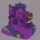
So, I finally got around to making another video for ya'll, plus this time I'll also explain my colouring method. First, let me explain my sketching phase. As you can see from the video, I don't have a rough and clean layer for the sketch; rather I lightly outline the forms I want to go over later. The reasons for this are, one: time. I don't want to spend so long working on one drawing, and that happens so often when working digitally. I try to not zoom in onto small details and get too nit-picky. That leads me to reason two: the sketchy look takes up room on the page creating false detail and giving a natural feel to the piece. All the details are there, you don't get bothered by little out of place lines since so many are out of place, plus you get to feel the movement of the pen as you look around the artwork. Drawing like this takes some patience and a lot of practice. Creating mythical creatures requires an artist to have the basic understanding of the animals used as the base for the creature. The hands I had studied from velociraptors. The wings are from bat anatomy practice. The body is a skewed approach to monitor and lizard torsos. The arms and legs are highly modified versions of our own arms and legs. The more you store in your memory bank, the easier it becomes to create something new on the whim, or in my case, bring a YuGiOh monster to life - sorta.
Next up is colouring. For me, that doesn't entail much. I try to keep it quick and painless. Generally, if I'm planning on rendering some line art, I would completely put aside any unnecessary hatching, which I did not do in this case because I am a absolute hatch addict. I colour in pretty much all my work by starting off with the Studio Pen brush.

Once I have a flat colour in place, I use the Colour Balance option to change the colour of the black lines to something richer and more vibrant- something that suits the colour scheme I'm going for. Choosing what colours go together is almost impossible for me to teach because I am still a student in that aspect. I find that it comes from releasing your inner diva/interior designer/ fashion designer and saying, "Oh no baby girl, that shade of blue just does not go with the fuchsia" a bunch of times. I used to make some great drawings only to have them utterly trashed once I put some colours on there. My girlfriend thought I was colour blind since I made some horrible choices. If you go back to my post from March 30, I explain how I use what I call sidestep complementary colours now. That has helped me immensely, and I think it can help you too, unless you're better than me which is also a possibility.

Next I Select the layer, preparing to go in with some nice complimentary (not complementary, big difference) colors. I choose friendly blue hues, encompassing the light, medium, and dark value slots.

Now that we have all the blue's in check, I'll move onto shadows and highlights. I normally don't do that anymore and stick to flat colours, but because I love you guys and girls for all the support you've given me, I'll succumb to the agony. Using a multiply layer with a warm greyish blue, I add shadows and values. I'll say the same sh*t every other tutorial says when it comes down to shadows. "Imagine the form in 3D. Do your best, Simba. Whatever the light does not touch will be in the shadows." -Mufasa. What it comes down to, study from reference to get the hang of it. Repetition, repetition, repetition, repetition. Basically, if you're not getting carpal tunnel, you're not doing enough... or you're doing it wrong. One of those. Moving on.

Now, same sh*t as last time, but instead of shadows, we high lightin' this motherf***r. I use a super cute and friendly light, warm purple. Light attracts to curves. If you look at an orange, a basketball, or your bald substitute teacher's noggin, you'll see that pinch of highlight bouncing off, distracting you from all else. Don't add too much or too little, but just enough.

And now, we add some noise, and we can call this a wrap. What I've learned through all this was that, "Oh, yes baby girl, that shade of blue does go with that fuchsia." I hope you enjoyed my short video and that you learned something from this. Also, YuGiOh was the sh*t. Bye!

Jason
2020-07-27 01:58:41 +0000 UTCszeroartist
2020-04-30 01:34:33 +0000 UTC