

As a comic book artist, my main goal is to have my audience feel like they're watching a movie, or a show when they look at my work. I try to keep that same feeling even when I work on a stand alone piece. I want people to see an art piece and say "I'd love to see this as an anime or a movie!" When I was asked by @celestine.art to critique his work, I took it as a chance to use it as an example for a lesson I had in mind.

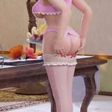
While looking at the above image, I noticed that the character is actually kind of cool. He makes me think of a mercenary after a long day at work. But the background didn't quite fit the mood I feel the artist was trying to convey.

The first thing with starting a scene is choosing a horizon line. A horizon line that is just straight ahead doesn't add much energy to a shot on its own. It works in a dialogue scene or even an action scene that has to include a lot of elements, but generally it is seen as the safest approach. For this piece, I could have gone with a down shot, which means a high horizon line, or an up shot, which utilizes a low horizon line. I chose the latter. With an up shot, I could show the window and the moon which were important elements that I wanted to include in the scene. An easy way to put a character in a scene is by drawing it nude, which takes the difficulty out of having to think about how the clothing would look.

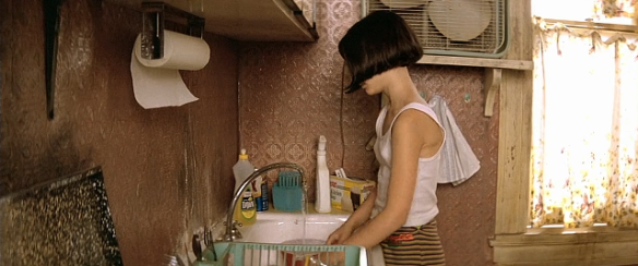
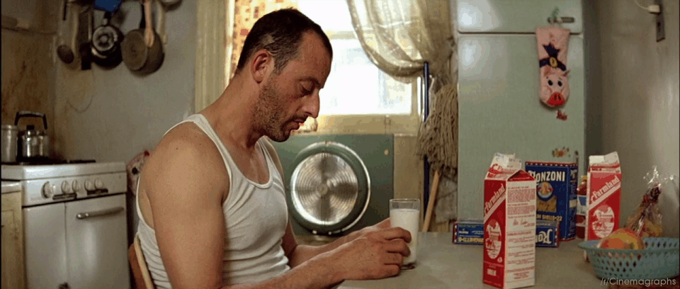
One issue I had with the original image was that the apartment seemed so empty. I understand that it might be a vacant suite, but I just didn't believe that it was a real apartment meant for humans. The most important step before I start a piece is research. I search for previous scenes in movies that might inspire me for my creation. I thought of a ghetto apartment and based my Google searches off that. I was led to "Leon the Professional" which takes place in a very small, and ghetto apartment suite.
https://yigyag.files.wordpress.com/2017/01/leon-5.png?w=585&h=245
https://onanimation.files.wordpress.com/2014/03/cinemagraph-gifs-leon-the-professional.gif?w=1200
I look for elements that would add to my own work, like the radiator, air conditioner, cracks in the window, and even the closeness of the adjacent apartment. I add my own taste to it too, of course. The original image by celestine.art has a large and almost futuristic looking city in the background, which for me, took away from the claustrophobic, and slum feel of the city. I added another apartment complex to fill that feeling.

Finally, we come to colour. I didn't add anything other than a cold blue, and a warmer orange. This was enough to create a sense of atmosphere. We know that it's night, and it's somewhat gloomy. Adding a little bit of warmth adds contrast to the piece and makes the overall image more enjoyable to the viewers eyes. The original piece had an intense bright light coming through the window, however that only happens if the air is filled with dust in which the light has something to bounce off of. I brought that light intensity down but added a few dust particles in the air. Even though I could work on this piece for 20 more hours, I'm happy with the feeling it conveys. I added blood to the door and couldn't resist to add in some dialogue. In the end, I have a tired samurai hit man resting after what can only be thought of as a long and seriously bloody fight.
I hope this tutorial helped you guys out with creating your own scenes. Try it out! Play with perspective. Research and add elements, and create mood through colour. As you can see, you can create a very dramatic scene with no more than 2 colours. Start simple and go from there. Have fun peeps!


