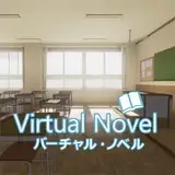
Cover Reveal
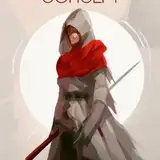
Added 2025-07-29 01:50:21 +0000 UTCI know I talked about changing the name for Flying Swords. That might be the title of the magical cultivation school, but the story has nothing to do with Swords and only has one brief bout of flying. So I'm trying out this title and cover. What do you think?
More and more romance covers are going with the abstract/floral sort of pattern, and this seemed to fit, and I like the "embroidery" pattern the graphic artist created with nothing more than scribbles.

Comments
I love the embroidery, looks very Chinese craft to me. I like the phoenixes (phoenices? Huh. Not a clue.)! You can't put all the words of the title in the same size; either they'd be too small to read, or they'd shove the embroidery off the page. Probably both. I think it would be better if it were all the same size, but I think you'd have to attack it from the angle of shortening the title. I did like Flying Swords, but if our guys aren't going to fly on swords, it's a no go. Hmm. Phoenix Hearts? Rising from the ashes of their former horrible lives? I'm not bothered by the two different fonts. Overall, I like the cover. I would ask if you sell in any brick and mortar stores? the ones I go to often don't seperate out the LGBT from het romance, and I rely on the signal two men on the cover gives me not to waste my time looking at stuff that isn't my thing. I have noticed the rise of covers that don't show people, and it's annoying in the brick and mortar store. I just look for authors I'm familiar with. And I do a lot more shopping online, where I can just search MM. I also have an artist daughter, and I'll run it past her when I have a chance. My tastes have never reflected the popular taste, so I can only speak for myself.
Gabrielle Henson
2025-07-31 01:20:07 +0000 UTCWhile I agree with the most of the comments, I realize that accommodating them all will radically change the amount of empty space, especially at the bottom. I think you can reduce the font size of "in the" with no problem, but balancing the other two lines will be tricky. If you do try to put the birds below the title, you may have to add something in the lower corners to frame your name. I like the black, but other dark colours may suit it better. Good luck! I think it looks fantastic as it is, just a bit of tweaking might make it better.
Simone (snowsim)
2025-07-31 00:51:48 +0000 UTC

![Murasaki [ムラサキ]](https://nokimo.com/istorage/44954.jpg)


![✪ .z [ ⭐️boy ]](https://nokimo.com/istorage/55080.jpg)