NokiMo
Artist Omar Dogan
Artist Omar Dogan

patreon


5C Arc 1 + 2 Book process

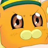
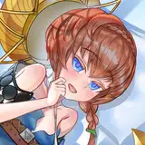
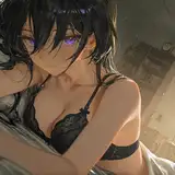
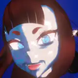
I got the print proof back for the first book this past Friday! I looked at it and decided to do some more edits. The second Arc suffered some very orange characters and since then I have adjusted my colouring style.

If you're going to do it, do it right. And so I shall!

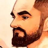
Without deviating from the style of that time, I have started doing subtle tweaks with my new colour palette and it seems to be turning out nicely! 

Above is an example! 

Again, the point here is not to redo the whole book, but rather to get the consistency to a level I'm happy with.

Maybe we should skip this whole patreon thing and go straight to books. If this book turns out well, I may just do that after printing the other books out so we don't have to wait! 

If we go that way please don't worry, we will figure out all the details and pledges! 

let me know what you think!

5C Arc 1 + 2 Book process

Comments

Yes, there's more form which I felt was a bit too abbreviated.

Omar Dogan

I have to go with what feels right and how i always saw it in my mind's eye. Also how it prints when forced to switch to CMYK is not flattering, they look a bunch of carrot people and we ain't gonna have that. The flatness of the shading on the face helps for sure to read expression and I do that more when the characters are smaller in the frame.

Omar Dogan

The colors on the right catch the eye. Need contrast between the characters and their backgrounds, eve if the left is more realistic. Reminds me of recent posts/twitter discussions on 'classics' being re-colorized especially greats from the 16 color newsprint days. Some - like Simonson's run on Thor were improved a bit but others, like Moebius's "Incal" suffered. European artists tend to be INCREDIBLE by American even Japanese standards - so they were able to absolutely use all the tricks including a very limited color scheme. Herge (Tintin) and others did things like scrubbing an alcohol marker of colors onto the back of his original so it'd end up a played down color that would reproduce that way. Most (again Moebius - RIP) just balanced the garishness just right. Thus it has that instant "Catch the Eye" and the modern by computer re-color is an excellent job but makes the image look flat/confusing. Just my .02 - you are excellent FAR better than my 2D style - but again the right one catches the eye better even though the left might be more realistic in color.

G Patreon Fan

Did you tweak the shading all over, too? Em and Viv have a lot more depth as well.

will davison


Related Creators