Hey everyone, happy holidays to those of you who happen to celebrate Thanksgiving, I certainly enjoyed my fill of the food and company :3
Lets get down to business!
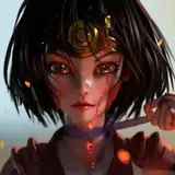
So as many of you might be aware I completed a project in the last posting and have had time off to handle some restructuring, project management and of course some r&r.
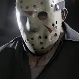
I'll be experimenting with a few things for the next project to see how the work flow feels. One of the interesting observations I made was the reducing of frames for export size. With the most recent project completed in HD (720p) I wanted to see what that looked like for uploads if I reverted to the standard time speed I used prior. Although I scaled everything back up to 24 frames per second I did notice that with some third party compression kits I was able to still fit in the upload for a 20 second piece. I can't be sure if color will add to that overall size since I only used two tones for the submission, so this will warrant more experimentation later.
What all this means is that I can still manage 24fps which doesn't really change the nature of my projects as the original idea was to scale it down to 16fps (the human eye can't distinguish separate images at speeds of 12fps or higher) Why accommodate for so many frames? Well smoothness is definitely felt with fully animated 24fps sequences, but more importantly I can make very quick actions much smoother by adding in frames to better communicate the flow of the action. I haven't really decided if I want to fall back on 16fps or 24fps yet. The benefit of the latter is that I can shoot on 2's and animate 12 fps, with in-between images filling those gaps if I have quick or complex action happening. In any case I'll be playing around with it in the next few projects.
Some other interesting observations was the use of gradients, color and line thickness. So the GIF image format is technically lossless, but only to a point, the color palette is rather limited so having a gradient that might utilize millions of values might not fit so neatly into the picture. Usually my exports work out just fine and I get the kind of look I want, however because its 13 megabytes it goes over the upload limit to a few key venues so I need to compress it down to ensure it can be done (I uploaded the first five seconds of the renders for each version so you can see the difference in quality before and after the compression.) What this usually means is that more information is lost or reorganized in such a manner that the output for a smaller file size including the gradient will have lots of artifacts, pixel tearing and other blemishes that remain on the screen while doing the playbacks. This is not what I want so having to make the compromise I opted to remove the vignette design around the frame to ensure a cleaner, crisper look. Line quality was also thickened, but I realized I didn't need to increase it that much for a nice look either, though this will make painting the cels much quicker since there's a little more margin for error in the fills. I think moving forward I would like to keep line thickness somewhere between what I had before and this project, while also dipping into some line weights since I liked how those experiments turned out from previous projects. Moreover coloring will remain a simpler affair with flat colors being used, gradients present too many issues with compression - but this doesn't rule out the possibility of shadow casting in the future.
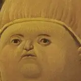
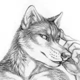
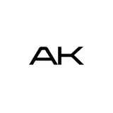
So where does this take us now? Well as you can see I'm still in the early conceptual stages with 2 other projects - yes that's right - I've bumped up my workload to 3 projects this time around (though I'll be prioritizing two of them until I my bigger project of the three is complete). I've used the time to play around with my logos, rebranding, digital water color and general sketching. Its always good for an artist to just explore various subject matter when they find the time, like a good form of creative stretching.
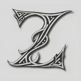
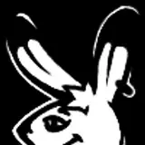
You'll also notice that I've redesigned my logos, I initially started all this with the 'White Rabbit' as my logo inspired by the playboy bunny. This was to poke fun at the adult nature of my works and the avatar I carried with me. Now that I've had time to develop my own creative space a bit I decided to go back and give the logo and banners a facelift.
That's all for now! Next time we'll delve into some of the pre-production insights for these new projects as well as cover some of the general news of my other ongoing projects that (I hope) are soon to be released.
Enjoy your November and see you next time!