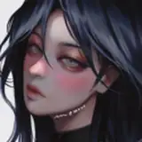
Started a new piece, still in progress!
I'm trying to find the type of art I want to make,, I feel like I'm not there yet and I think the main thing I'm uncertain of is color? Something about it feels like I'm lacking, I'm not sure how to put it into words, but when I look at the artwork, the paintings I really like, with moody, somber colors, but still clear and beautiful too,, and I look at my artwork I know for a fact that there's still smth big that I'm not getting.
And it's not that I think my color-usage is "bad", the best way I can describe it is that it's very straight forward? And that's not necessarily a bad thing! It's just not the look that I'm looking for. Red clouds are red, turquoise fog is turquoise..
Hm, man I've forgottem how much writing my thoughts down help me get a clearer picture of the problems,, like, now looking at this, putting it to words,, I think the issue is that I am too quickly satisfied with simple answers when it comes to color, "what is a striking background sky? deep red, ok let's make it red" And all while I'm putting way more effort and thought into anatomy, perspective and composition, I'm here just using 1 color hue for rendering the sky? Why not put more thought into giving it more variation? Why keep it so simple?
I should know that you can use at least 3 colors for rendering! The blue-green of the fog might offer a good color contrast, but it too is all the same hue!
My coloring process automatically unifies color variation when I'm adjust sliders, and using overlay/hardlight/etc filters, so my process/method needs some changing if I want to add more variation