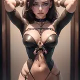
Sooo, since I did this one entirely at school I did not have any video footage. But since I had kept the different stages saved in my layers, I thought I could go through the process with some explanations.
In case anything is confusing or illegible, let me know and I can clarify!
Also I gotta mention, my coloring method is basically "whatever fits, fits", usually I lean towards coloring with "multiply", but here "hard- and "soft light" fitted better.
(shoot,,, in case any of you don't know digital programs, I'm talking about the layer settings. I also mention "difference" (a layer setting I rarely use), which put's the colors in inverse (reds->green, white->black, for example.)
The main risk with coloring a black/white rendered drawing is that the coloring might get muddled or look very unnatural. My best advice is to keep it simple. Don't use too many different layers and adjustments, try to be very minimal.
Though of course, if you have found a method that works for you, then go for it! I'm mainly talking from just my own experience with coloring.
And lol, don't underestimate the power of the subtle touches, that rainbow gradient map at 3% opacity worked like magic.
I'm really happy about how this looks? I think spending hours upon hours rendering 1 single image for background class really helped me think about shape and light/shadow with a bit more care. I've had spent a lot of time last year worrying about how in the hell to achieve that "professional" look with my artwork, and I think smth has clicked into place here that has gotten me closer.