ASAKI will explain how to improve the texture of the skin that sometimes uses.
I will add explanations below the image, so please read the text while looking at the image.
In addition, I think that the Large image will be better understood if you click on the image to confirm it.
Also, PSD is available, please refer to it.
(My English lacks accuracy, I use automatic translation and passion.)

First of all, I will do my best to paint the base skin.
At this point, I think that some people say "I can not do it!", But please continue reading for the time being.
This is a "texture up" technique, so it's a technique that "makes it look like raw skin" regardless of the level of base skin painting, so the level of the painting skill of the reader is irrelevant.

In order to add accents to monotonous skin, be aware of “random light unevenness” that occurs in pores and fine wrinkles, etc., add a new layer centered on the bright part and the part of the turn of the tone, and pointillism with a brush I will continue.
However, it is too subtle and it is difficult to understand that "what" is being added in the image above .... Please see the image below.

I placed a black layer under the previous layer to make it easier to understanding.
I think that I understand that it is not the translation that I added to the whole skin. As I mentioned earlier, it is enough to add a brush only to the bright part or the turn of the tone.
For the selection of the color to be drawn, use a dropper tool. It's really inconspicuous if you make it the same color, so it's OK with the "nearby" color to add the brush. It is important to dare to make it uneven.
However, if you draw this point drawing one by one, you will get tired, so let's solve it with a brush.

The ellipses are randomly scattered, and the size and transparency change with the pressure.
I think you can do the same thing with your own software.
Yes, I will go next.

Change the deep shadow part to a little purple.
ASAKI selects the dark shade in "Select color gamut" of the selection area and spreads the width moderately.
Create a new layer and fill in purple if you can select it. You can not be too purple, so moderately. Adjust the transparency of the layer or scrape it with an eraser.
A purple shade makes the whole skin softer, with a deep skin tone.

Condition of the purple shadow is like this.
do you understand? Although it is quite faint, the effect is great.

Add redness to sensitive parts ....
Direct view of the crotch area is a hindrance to concentration.
So, put on a bikini.

Hiding in the bikini, but I will copy the skin layer later and use it to create a "skin feel" over the bikini layer. So, the bottom of bikini layer is also painting the skin properly.
At this point, the skin is still flat.
It is not enough.

I will add highlights to the edge of my skin.
Highlights that are exhaustively calculated are great, but fake highlights are enough here. Because The atmosphere is important.
Experience is required to know where to put it in order to be effective. At first let's put in the extent not too bright anyway.

My abdominal muscles were too strong so I made it smooth.
Don't be afraid to paint around here. However, to the extent that you do not erase too much the previously sketched part.

Next I will draw a blood vessel.
I have laid a black layer for clarity, but add blue blood vessels to the new layer.
I feel uncomfortable when I draw a lot on the whole, so while adjusting moderately ....
The front side of the screen is thicker and the back side is thinner.

I changed the blood layer vessels to "hard light" to 9% opacity.
It has become quite fresh feeling. The part where the drawn blood vessel is too conspicuous disappears, and conversely adds it.
and adjust according to the painter's preference
Adjust carefully where the eyes of the viewer gather, such as tits and thighs.

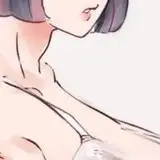
Human skin is quite mottled. It is not a completely uniform skin color as applied with a spray for the convenience of capillaries and fat.
The above image is a combination of such reddish mottled feeling.
What layer did you add ... that is ...

changed the this layer to "Burn(Linear)" to 9% opacity.
The layer itself is filled with white, like a cloud brush, and it is really smeared. This layer is really Loose and all right. Those who are conscious of strangeness tend to be unnatural because of regularity.

Add sweat.
Compare this with the first image.
It is important to take time to apply and apply technical skills, but with the techniques introduced here, you can produce freshness with less effort.

Finally it turned red too much, so I finished adjusting the yellow to be stronger.
Make a semi-transparent copy of the skin layer integrated with the bikini to make it look like it's really good.
this skin is very lewd.

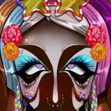
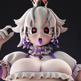
This illustration is the same technique if you look closely.

How was that?
ASAKI uses Photoshop, but you should be able to do something similar with other software, so try your own to challenge yourself. I think that the effect is great for HENTAI illustrations
This post is good? If you think so please press the Like button.
Thank you.
I look forward to your support as well. (This is main XD )

Dan Mapplethorpe
2019-09-12 01:32:55 +0000 UTCCLT199
2019-06-16 17:16:22 +0000 UTCSaehrimnir
2019-06-15 02:44:34 +0000 UTCnd
2019-06-15 01:10:45 +0000 UTC