It is much easier to read now. Thank-you. Many times when I am doing work with fonts, and I have an issue with a particular character, I will substitute in a character from a similar styled font set.
MiddKnight
2017-09-26 17:39:33 +0000 UTC
I changed the font; how is it now?
Jeremy Bernal
2017-09-26 13:08:14 +0000 UTC
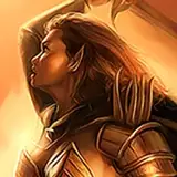
Only those who are sure of their skills in subduing a succubus will ever get this far and not end up shriveled and dead. Well worth the effort!
RicanWolf
2017-09-25 20:41:41 +0000 UTC
Small critique: The script on the bottom left corner was a little difficult to read. It took a fair amount of zooming and re-reading to work out what it was saying. The incomplete leading arms on leading "r" and "y" characters, and incomplete bowl on the "b" made letter identification difficult. Additionally, the kerning on "i" in "Silice" also resulted in some difficulty.