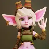
Hi everyone! So I'm doing the new Logo for the new series of PBB called for now "Pleasure Bon Bon Next". I need your suggestions!!!! This is only the first starting idea, to create a RAINBOW logo! Why a rainbow? For many reasons! Appears after the rain, each character of the series is connected by a specifed color in the name or in the body, for the gay presences in the story ( Betty is bi-sex, Dorian is gay and William play the gay role during all the story), for the peace, for the unicorns! Ehehe, ok there are no unicorns in PBB... but I love unicorns :D ! Maybe Violet will meet the unicorn of her dreams? Dunno XD Let me say that it is only a WIP so the first concept layout, not final! Obviously the first logo is more "finished" and solid! I just have to understand what to leave and what to change in this first layout. So if you tell me "the new logo layout sucks. You must take the old one and only change the color" XD I'll get it done and I'll trace the old font and change only the colors. The only thing I wanted was to make a silhouette of Mary, rather than Violet (in the beginning I chose Violet because of the color and because it was the most fleshly character, but the protagonist is Mary!). It's okay also naked, no corset and gloves, but this time without a nipple in sight. I do not care if you are not artists, you are the readers and you must enjoy something at first sight. So tell me what you think and if you have ideas on how to make the new beautiful rainbow logo! I will say that my Patrons were my consultants :) Thank you!!! V.
PS. As soon as the new logo it's finished you will see it on the new character design of the main cast ! So hurry up to give me suggestions so I finish it soon :) Sooner it will be ready and sooner you see the new drawings, I have prepared 8 black and white characters to show you! I can't wait to do it!
Vanessa San
2017-10-22 13:56:35 +0000 UTCVanessa San
2017-10-22 13:51:31 +0000 UTCSymphony
2017-10-22 12:05:12 +0000 UTCToddRogue69
2017-10-22 11:09:45 +0000 UTC