Illustrated by Miitara
Hello there!
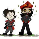
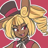
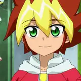
As mentioned, we'd like to add little 'cutscenes' between each chapter. Since the chapters are only 10 pages long, this gives us a way to provide necessary exposition without sacrificing too many action scenes. Plus, it's another way to pay tribute to the Storybook games.
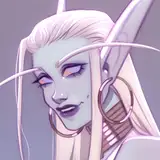
We considered two styles—1 and 2 inspired by Greek pottery, and 3 and 4 inspired by Minoan frescoes.
Style 1-2 (Pottery): These are based on traditional pottery, using simple, flat shading. The color palette is quite limited, with high contrast, making it hard to balance character visibility with background details. This style is the most expected and straightforward, but the limited colors may cause repetition across images, making them feel less interesting in the long run (haha). Besides, it looks a bit too much like Secret Rings' cutscenes.
Style 3-4 (Frescoes): These offer a more flexible approach, with dynamic color palettes and backgrounds, and they stand out by not resembling the aesthetics of Secret Rings or Black Knight. Though less famous than pottery, frescoes provide a unique, vibrant style that respects Greek history while giving the artist more freedom. Miitara finds these styles easier to work with, despite their complexity, as they allow more creativity with colors and create clearer, more distinct scenes.
Conclusion: After weighing the pros and cons, we decided to go with Style 4, as it offers more visual variety, complements the artist’s strengths, and avoids the repetitive feel of the pottery style.
Equestrian Alchemist
2025-03-13 20:04:28 +0000 UTCLummh
2025-03-13 15:56:00 +0000 UTCjohn rhys
2025-03-13 15:08:17 +0000 UTC