EDIT 2: Quite a split on the color choice! Here's something I thought I'd try after reading the reasons why you guys preferred each hue. I quite like it! I also made all of the text a little bit more bold so that it's hopefully easier to read now.
EDIT: I just caught the double "least" and will be fixing it soon.
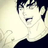
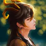
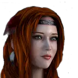
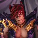
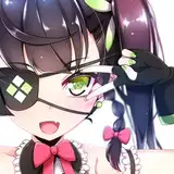
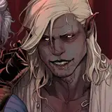
I present to you, the new and improved DU drow character sheet! I've been meaning to replace that ANCIENT art that I have on my tumblr's pinned post for ages now 😂
The different versions of this character have become so prevalent in my art that it only felt right to include them in the updated sheet (well, you guys haven't seen much of the last one yet, but you will soon 😉)
DU drow's original sheet art had that blue color scheme, kind of in reference to the way his skin reflects a similar color. However, I feel like that burnt yellow tone in the second option has sort of become "his" shade, so I'm tempted to change it! Let me know if you have an opinion about it.
Fun fact - I almost kept a bunch of his stats uneven like they originally were just to enrage the DnD nerds - then I remembered I am now also a DnD nerd 😔 that said, if you ever get bored the comment section on this thing should provide you with endless entertainment.
Shandora
2025-10-21 12:52:58 +0000 UTCwwx29
2025-10-20 00:46:34 +0000 UTCfire burns
2025-10-16 20:43:19 +0000 UTCTaro
2025-10-16 16:10:50 +0000 UTC