NokiMo
skailla
skailla

patreon


Page Style Test (failed!)

HEY GUYS!

It's still page day on Fridays, am I right? xD

I hope this is not to spoilerish! HAHA

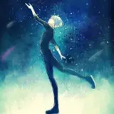
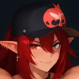
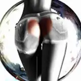
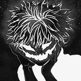
Yet another page style test for you all! But this time, it's a "failed" one!

I tried to go for a "Shut Eye" look on these. I won't lie, it was a lot of fun! working with colors like that has a lot of potential.

I've also tried a different style for the lineart, using more weight and going for a more "classic comic" style.

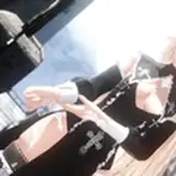
I'm once again using the white borders (which I believe I'll be keeping, after the absolute nightmare of ajusting the page's formats for printing and having to paint 100+ comic page borders just to get 0.5 cm of bleed! And I'll have to do it all over again for the English version now *drops*)

Using a fine white line to emphasize the characters in some panels was also fun and it helps to make them pop!

I'd really LOVE to hear your thoughts on this page, and if there's anything about it that you like! And of course, I'd love to hear your thoughts on the exchange between these two characters!

Have a wonderful weekend and thank you all for sticking around!

Page Style Test (failed!)

Comments

Would make for a good palette for a negatively charged emotional moment, I think, but the whole comic like this would give me a headache lol. I much prefer your vibrant colors even if the art style is different.

Akiriith

Love this interaction with Steban and Sam you can feel the emotion and tension in here. The look in Sam’s eye my goodness I think he knows something that we may not know about him which will make it interesting. For this style I think it might be a bit too sketchy in a way like I agree with Lombarsi with the storyboard and planning. I’m interested to see how it will come out for book 2. Don’t be too hard on yourself it’s all about experimenting and learning finding the perfect way for you and the right balance. I know that you definitely get there keep up the amazing work Skailla! ☺️☺️☺️

Maverick

Yeah I agree with Andrew. you're too hard on yourself. It's still somewhat reminiscent of shut eye, at least in my opinion. Either way the page is flawless so it's a win-win regardless. Depending on circumstances a fail can turn into a success, this is a perfect example.

Dave

I agree! The lake scene is the best so far. 💖

Znydragon

It’s so cool getting to see some of the prototypes for the new style! The drama is perfectly conveyed here, and I love the lore implications 🤩!

LOM

I think this looks good I think your being too hard on yourself

Andrew Quintero

Based on this and the one with Faye. I'm guessing you're leaning in the colours going along the scene/emotion insted of "cinematicly realistic". How it had soft yellow to express the warm nostalgia and then this has strong shaddows with cold blue to express fear and maybe some mix of anger and sorrow from Sam. I'm not sure if it just looks that way but I always love the un-natural shading in art

SilverTwistVI

WOAH, the style of this page looks AWESOME!! I really like the style you were going for! And I think you did a nice job executing it! 🤩 I really like the way you drew the highlights on Edgar, I think it looks really cool! ✨ This exchange is really interesting! I wonder how Edgar could sense that Steban has seen the Devil 🤔 I love the tension throughout the interaction as well! You did a great job with it! 💖

iiKittyKatPxw

Man, I love the tension in this page! 😀 This is so good! I love Steban's shocked expression here, seeing how Sam is reading him like a book! How does he know all this?! 😯🤔 I can sense that this scene is leading into some big new development in the story, and I can't wait to see what happens next! Interesting how Sam knows so much, but we don't yet know why 🤔 Well I don't know about you Skailla, but even if you call this a failure, I'd say it's a successful failure 😁 Even if the result isn't what you were going for, I think it's still awesome nonetheless! And even if you think style failed here, it certainly doesn't take away from how tense or gripping this scene and dialogue are! It's great stuff!

AeroDog

Ok so like, I love this one cause I love sketchy styles how ever I can see how it'll look unfinished and like an outline. But the one with fay at the lake is probably the best fit for the story thus far

Miss. Isaacs

The color style is pulling me out of the immersion, I dunno, just kinda not fitting for the comic I think? It does look simpler and quicker, but it looks that way ya know, like a storyboard, which you probably don't want to go for. The thick lines look good in the last panel, I think too thick for farther away shots like panels 4-5. Hope this helps.

Lombarsi

Interesting page!! Oh man, the spookiness of this page is just chilling! I love the way you made Sam’s eyes look almost mad, like he’s gone mental or something. I can’t wait to see the context of this page and what happens to Steban. Could this be the catalyst that pushes him to run away? As for the style itself, I would say this is probably my least favorite out of the 3 so far. The “Memories” page was by far the best! However, I do like the thin white borders and the dramatic lighting in this piece! I think if you incorporated this lighting into the style and background of page test 2, than it would look phenomenal! If you wanted some inspiration for some styles I think would look excellent, I think these artworks you made could work well! https://www.patreon.com/posts/sleep-48485966 https://www.patreon.com/posts/dtiys-final-duel-52737009

TheArcherDragon

You sure you failed? Because this looks amazing 🤩 💖 I really love the intense and eerie atmosphere around them

Zai287

This is for sure tense scene (that I'm excited to see when it's full and ready) I can kinda see style you were going for and it could be nice❤️

SilverTwistVI

Gotta say, this one isn’t my favorite of the 3 new styles you’ve shown us. I really like the art style of last one of Steban and Faye sitting by the lake.

Znydragon

“Answer me one thing”, proceeds to ask two things But yeah, I like the idea of what this was going for with the colors and the brushes, but I think this style is a bit TOO sketchy, if that makes sense.

Doglover502

I NEED TO KNOW WHAT HAPPENED TO OLD BONE NOWWWWWWWWWWW

Stefan Balugani


Related Creators