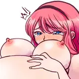
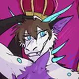
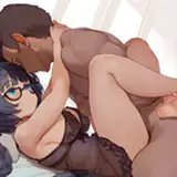
NokiMo
skailla
skailla

patreon


NoN - Late Summer - Page # 02

Hey guys!

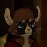
Here's page 2 of the little scene sequence! 

Thank you so much for leaving your comments and impressions on the first page, and I would love to know how you feel about this one. 

Like I mentioned before, this is some sort of hybrid between my classic style and the experimental one. The next two pages will be in this same style. 

Have an amazing week! 

NoN - Late Summer - Page # 02

Comments

So Skai, what style do you choose to make these too-good-to-ever-be-seen comic pages? Do you choose the style on the first page or the second page to continue to make your marvelous future comic? I'd love to hear from you! :)

doggokitty

I feel like the thicker line art of the first page does a really good job of making the characters stand out, especially for close ups like in panels 3,4, and 6. The thinner line art from the second page lets the characters stand out less and puts more emphasis on the background, which works well with the last panel of page 2. I'd be interested to see a page that mixes the two styles between close ups and wider scenes.

Austin Davis-Boltz

Page 2's classic hybrid style really shows where there is reduced boldness on the lines, particularly on Delilah. The shadows are more distinct in this style than page 1, as there is almost a watercolour look on the first one. The environment feels the same, but I will assume from what I can see is that your change of style mostly impacts characters in the panels. I like the water, it's illusion of transparency (by whatever technique you have used) makes the comic loosen up on the cartoon appeal, but in a good way. In panel 5 of page 2, I assume that Stebans whole head should be dripping and/or damp looking (unless I am not noticing the effect, or the uniform of your style aims to avoid this visual element). So I apologise if it's just me, but that's as critique as I can be and I hope I have helped somewhat significantly to better your decisive action on the preferred style. As always, superb comic. And very funny. What gets me the most is how original the humour is. Well done!

DoggieDiversity

Gotta agree with Epic SaveRoom. Up And Ahead art was great, but the backgrounds lacked some... life. Thought there's not many life in the desert, I understand it's hard to do better without it becoming too extravagant, thus mainly leaving the focus on the characters. Those new backgrounds, being a forest, might be easier to do. The colors are more eye-catching, and once again, your lighting is just perfect in every aspect, blend in so well with the the background as well as on the characters. You couldn't do that with Gold Marrow's desert environment.

Melvin

Stebans face in panel 3

Garrett Bennett

Awww that's an adorable scene with Delilah haha. The coloring and work put into these panels is astonishing. As for a style I like it, it's professional looking and pleasing, but I do also love your old style as well, I hope you don't abandon it, at least still do it for deviantions (I'm looking at Summer's End with the awesome lighting and shading effects, color dodge etc) I wouldn't be able to choose between the two styles. The deeper shading and such like in "across the desert" and in Up and Ahead is awesome, but this new style is great. Up and Ahead has that animated movie look to it, more digital, but this has a warmer vibe and overall the panels all look like the belong next to each other more when in the new style, if that makes sense. I think this new is better. In Up and Ahead even tho you have awesome backgrounds and they take up as much 'real estate' on the page as they do here, the Up and Ahead style really draws my attention to the characters and not the backgrounds, dunno why, but this new one the envirornments are very noticeable and make me want to spend more time looking at the art of the panel, maybe cause it's more fitting to the character art.

Lombarsi


Related Creators