So, even though it's behind a wall of Mr Peanutblubber, I DID draw a full background and wanted to share the whole creation process with you. This will be the first in a, hopefully, recurring series of posts after each monthly early access piece. I can't claim to be an art master but hopefully this is able to help someone.
Idea
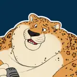
There were several good candidates for the follow-up picture to the Tigress one, but in the end I settled with Mr Peanutbutter from the Netflix series Bojack Horseman. His happy go lucky attitude makes it a perfect character to fatten up. As excitable as he is, he could easily wind up in a situation where he's totally oblivious to his new found size. Once settled on Mr PB, it's time to brainstorm.
Initial sketches

Went through several screenshots from the show, to try and find a good vibe to draw Mr PB on. Here are some examples:


Wanted to avoid a regular 3/4 standing pose, so in the end the winner was the sketch on the lower left corner. Which is based on this pose here:

If you notice, this background was what I originally intended to go with. Mr Peanutbutter at a photo shoot, showcasing his enormity. Probably to be used as some sort of publicity stunt.
Developing the idea
Since I've been trying to force myself to draw more backgrounds, I switched the idea from him being inside a sound stage to an exterior shot on a sidewalk. Combed again through the series, this time around remember the 'generic' songs montages, but as the songs, the street backgrounds were rather generic as well. Then came across a scene where Bojack is throwing $1 bills from the roof of a store in the series' version of Rodeo Drive, which though it would be a good choice, given that storefront displays can be quite intricate.

Once the background idea was selected, then decided to do a quick sketch of the idea, adding Bojack in the process. He keeps a sort-of rivalry with Mr PB, so I suppose it's in character for Bojack to be exasperated by the latest crazy scheme Peanutbutter has in mind. Here's how the sketch ended up looking:

Cleanup
Layout's done, so it's time for cleaning it up. Started out with the star of the piece. Usually, it's better to begin with the background since it will dictate the perspective and the position the characters are in. But in this case I went with a similar style to the series, so there's barely any perspective. All vertical lines are parallel to each other. It's at this stage that I went digital. For those of you wanting to know I use Procreate.

After this pass, a good friend of mine was able to help in defining Mr PB's left arm and shoulder. Made him a bid wider too. Here's the result:

Very pleased with how it was coming about. Next step, add in the background and Bojack to the scene. I originally went with a similar looking store than in that money shower scene as you can see here:

Apart from the store facade, the palm tree and trash can, they give a size reference point and helps us determine how big Mr PB really is.
Wasn't happy with how the store front was looking so went for a look around on the real Rodeo Drive in Beverly Hills, over on street view in Google Maps. Really liked the design of the storefront for the Cartier boutique so I went with that. Coincidentally it would seem that it was also the basis for that 'Fois Gras' store in the series.

I used to work at a design studio, which specialized in storefront decoration, mainly of high end brands. The themes we would work on would be related to the latest collections the brand would be promoting. So they would be temporary, while the collection was on display. To give this store a distinctive flair and not make it an exact copy of its IRL counterpart, decided to go with a Frank Lloyd Wright theme. Here's a mood board of the designs I used and then how they were placed on the drawing.


As for the designs of the display cases, I went with some references of store fronts of a shopping mall in the city where I live.


Inking
The design is all done, so the last step is to start inking proper and placing the characters in the scene. Given that Mr PB is so large, he ended up blocking the view of the whole store. But the plus side, is that I can share the background without the characters and its also a good exercise.

Color
Last but not least, color is added in. Staying true to the show's style, most of it is simply colored in flats. Character's fur is indicated with some darker and lighter tones mixed in which gives it it's signature texture. Added some texture to to the store front to evoke marble and give it some distinction to it.

Hope you enjoyed this post, and would like to hear your thoughts on it. Would you like to see similar content with future pieces? Does it have a good amount of detail? Is it too detailed? Any feedback you'd like to give helps me provide better content for you going forward. Thank you so much and looking forward to read your comments!