NokiMo
redscript
redscript

patreon


GUI placement and general look of the game

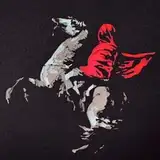
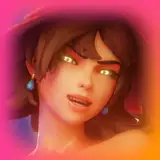
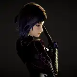
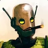
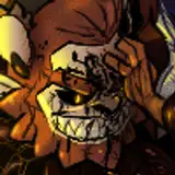
I've been wracking my brains around how the game is going to look. How about the text is to the side of the window, to the right, as seen in the new Shadowrun games and Disco Elysium? The developer of Disco made a point - for most people, the lower-right part of the screen is the most comfortable to look at as most of us often look at our right hand. 

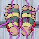
I know the traditional visual novel placement is on the bottom, but I want a full screen to play with so I can pop the feet out. Also, I'm looking at how small story-frames look in this setup.

If this would be the general look of the game, I would be pleased. I still have to work on those windows, though!

I'll do some more rearrangements to see what's best. Once we're settled on the general look, we can start making the assets.

GUI placement and general look of the game GUI placement and general look of the game GUI placement and general look of the game GUI placement and general look of the game GUI placement and general look of the game GUI placement and general look of the game

Comments

Thank you very much! That's what I want to deliver.

Redscript

hi i am new here, loved your previous game damed soles. Would love to see another game like that with lots of tickling and maybe m/f fj too

Zieke

Going back on your decryption for why you are thinking of designing it like that so you can have more real-estate for feet is definitely understandable. Anything for more space for feet is a plus. But yeah going by other examples of different ui formats is not a bad idea. But also I kind of like that example you gave us too. I am just as on the fence as you are with this lol

Quote

I don't know about the dialogue either. I'm deferring to people with more experience than me. Still, every visual novel from the 90s can't be wrong, right? I don't know.

Redscript

Hmm, my first initial impressions is that I really like the overall aesthetic so far. It reminds me of that old fps game blake stone, specifically the ingame title screen with that specific kind of sci-fi look, I really like that. The overall UI seems great how it's set up with that inventory or status window, the player character and the like. Though not sure how I feel about having to always look to the right to read the dialogue but that could be me nitpicking and it would be something I would get used to quickly. The little frames on the "gui look frames and back" look really nice when you have the background art still there.

Quote

Yes, that's what I was looking at. Some pics will have a black background, definitely.

Redscript

I feel like the big should be darkened when she starts licking her feet

Feetanon

Hmm the pictures being in the middle feel a bit weird but I like the other stuff is placed.

Feetanon


Related Creators