Okay, time for opinions.
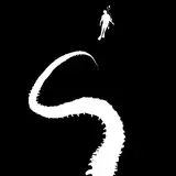
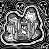
This art is by Paris Ioannou.
These are three options for the cover of Book 2.
We can mix and match things.
What elements do you like the most?
(There's no guarantee it will end up exactly like this, and the lich in Ch 4 might not be this lich.)
My thoughts for what to combine:
1) Kelin's stance/posture from A (although all three are good). Except his staff shouldn't be so pointed/flared.
2) The lich from C, except the hand that's reaching for Kelin needs to be more like a claw instead of widespread, I think. Maybe get rid of the spikes on its back and add other details?
3) The upper broken building from B.
4) Add enough background at the top for the title, so the lich's head isn't in the way.
Anya Eden
2025-05-15 14:59:55 +0000 UTCStephen
2025-05-15 03:20:22 +0000 UTC