This is a follow up to the post about the character design because I wanted to share some more process elements and a timelapse of these drawings at the end of the post!
This timelapse is a little goofy because it started as just a sketching file and then it turned into Garden Witch design explorations.
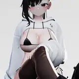
Garden Witch Preliminary Sketches
Garden Witch design, plus sketch layers and a sampled color palette change.
Playing around with the new Garden Witch proportions in different poses so I can understand how she actually turns in space.
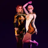
Zelda/elf sketches + Libby and Aster because I'm starting to miss them.
The next batch of drawings are the process steps Iggy🐸 and I went through to figure out the direction for this background
I suggested something with a big beautiful garden bench, this was Iggy's original sketch
Winton's "counter offer" idea - bigger bench, raking light and a book so that the witch can have a prop.
More refined Iggy sketch + perspective guides I laid in so we would both have a clear idea of where the camera is. I tend to like these more telephoto lens feeling compositions because they feel more vintage illustration-like because the perspective is a bit more flattened and not wide-angle.
Iggy background color sketch!
I think this could be the caption for everything I post. I got really excited after completing the last garden witch animation and that minicomic because it feels like really exciting new creative territory and I am filled with ambitions visions of making short animations.
I can tell I haven't done a good job of juggling those ambitions the past couple weeks because I've been running into a lot of indecision and slow progress this month. I don't want to continue spinning my wheels so I decided to try to limit and refocus.
When Iggy did such a good job with the last background I thought "oh I need to make the animation way better than I planned to match it!" This is the dangerous thinking trap I fall into a lot, not because it's bad to be ambitious, but when I'm ambitious on side projects, it costs me progress on what's supposed to be my main focus.
 TOO MANY OPTIONS AAAAAH
I started thinking about all kinds of poses for this new background, if there could be narrative animation before the sexy bit, plus indecision on what the character design should be like.
Then I tried to do a single finished frame, based a little bit on the style from the last one and it got way too detailed.
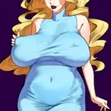
 Early attempt at a character in this environment.
Once I realized I was going in circles I knew I had to simplify things down again. Just because the first animation looked one way doesn't mean we can't change the style for the second one as we find our way.
A simpler character would be easier to animate and help the scope of the project. Then I remembered Eve from Dragon's Lair II and how much I enjoyed how all those shapes flowed together.
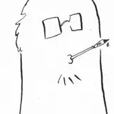
 I found it helpful to just lay down a few circles to define the proportions of the character and the roundness of the face.
 To me good character design is something that is fun and flexible and comes out of my pen easily, like the shapes feel natural to me to draw, because I'm the one who's gonna be animating it.
Since I don't really have a consistent animation process, it can feel like I'm starting from scratch every time, and I feel like every extra line I have to draw means less time that I can spend iterating on or improving the motion, so simpler characters are a good choice.
 I don't feel very practiced in this cartoony style, so I'm still trying to figure out how heads turn.
I'm trying to keep this witch simple by having some cartoonish details to anchor her to the style, like sharp angles in her eyes and real small hands and feet. I feel like when I don't have this, my drawings just get more and more detailed without me realizing.
From an art direction point of view I've been thinking a lot about the glorious color palettes of shows like Sherlock Hound and Sailor Moon, both of which I've been watching lately.
 Poster paint palette with two possible line colors, I kinda favor the brown one.
Since we're kinda aiming to be in a Ghibli-esque neighborhood art direction wise, I thought I would put together a color palette by color selecting the cel paint colors from a variety of stills from Sherlock Hound and this is the palette I came up with.
 Sherlock Hound (1984)
Essentially I'm trying to limit us to the same jars of poster paint as that show's crew was working with as a way of honing in on that charming, limited feel. I love how they get a sense of light and atmosphere just by showing that little sliver of light landing on the blueish carriage that makes everything else feel like it's in shadow.
 This Charlie Brown-ass curly Q of pubic hair is symbolic of the simplicity I need. It is my north star.
Sometimes it feels like I'm trying to be cheap by being so "budget-minded" all the time with my work, but then I remember that my satisfaction really comes from the cycle of picking small projects I know I can finish, learning new stuff and then immediately trying again with the new knowledge and experience.
When I'm trying new things, I need that cycle to be really short because I don't have the patience or confidence to see the long-form version through yet.
Being really ambitious feels great in the moment, but repeating failing to follow through is discouraging. So while I hoped to do more complex animation this month I'm going to try to focus smaller and take a little longer so I can put more of my effort into finishing Faun x Swordsman stuff.
Happy weekend!
❤️Winton
Winton Kidd
2025-09-16 02:23:50 +0000 UTCValeRipley
2025-09-14 06:51:47 +0000 UTCWinton Kidd
2025-09-14 00:46:10 +0000 UTCZack
2025-09-13 23:16:03 +0000 UTC