Way back in the mists of my early freelance career, my pal Matt asked if I'd be game to design a t-shirt for Ojai's beloved outdoor bookshop Bart's Books. I found the idea terrifying because Bart's has been my favorite bookshop my entire life and they'd also just gotten one of my local creative idols to design something and they get featured all the time in those "Top Ten Most Incredible Bookstores in The World" posts on Atlas Obscura and I was plagued by imposter syndrome and all kinds of other dumb thoughts. Also I was busy! So I kept putting it off and putting it off until I moved home to Ojai in 2021 and then I was seeing Matt too often to realistically avoid it any longer (he manages the store and is always there when I wander in looking for an obscure volume of poetry or a friend's graphic novel).
(Also I'd gotten better at art in the intervening years and made a whole-ass book about imposter syndrome and even celebrated its release with an event at the store so I guess that helped, too.)
ANYWAY. This is how a designed a couple t-shirts for Bart's! Patreon was made for this!!
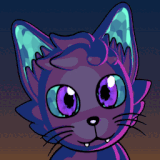
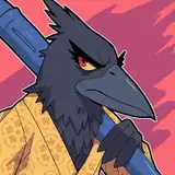
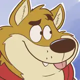
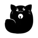
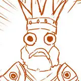
I did all these little sketches in Procreate on my iPad while I was up at Wayward late last summer. The shop has a cat (Simone!) who I definitely wanted to feature, and citrus trees growing inside it, so there were some common themes to explore.

(I didn't make a color mockup of Option C because I was daunted by drawing an isometric maze made of bookshelves. Fortunately Matt didn't pick that one.)
It's always funny when I've been sitting on a gig for a while without drawing anything and then finally get around to making sketches and they all just come flooding out because of course my brain has been noodling away in the background even when I'm not actively Working on The Job. It feels fake! But that's creative work, baybeee.
After Matt decided they wanted options A and B, he asked me to work up more finished versions. Screen printing has some specific constraints attached to it, but the biggest one was that we could only go up to four colors (each color requires a separate printing pass).

Cartoonists are generally big on lines. We ink things with dark outlines and calligraphic marks and then color inside those spaces. But with screen printing there's incentive not to waste a whole color on outlining. I've been wanting to get better at drawing with shapes instead of lines for a long time. One of my favorite pieces of art in my room is this enormous Yuko Ota screenprint. I just love the way she uses all these overlapping color blocks! Anyway, I had fun trying to figure out how I could use the same ink color for multiple elements in each illustration.
The less said about picking colors, the better, for it is a Mug's Game. Any option could be correct! So much is subjective!! WHAT IS EVEN REAL ANYMORE??

I eventually gave up and just went back to what I'd picked at the outset, more or less. I hate this part.
I wanted to be a dream client and send my friend Chris, the printer, perfectly separated files with each vector layer all ready to be burned into the screens he'd use for printing the different colors. (Vector art, for those of you who might not be familiar, uses math to make MAGICAL SMOOTH SHAPES that can scale without losing any fidelity. Raster images can get pixellated if you resize them too far up from their original dimensions.) BUT, plot twist, I don't really know how to do vector art good.
There's a valuable function in Adobe Illustrator called Live Trace that can turn raster art into vector, but I didn't have Illustrator. I wasted a lot of time using various free conversion tools and trying to mess with their inexact results, but when I finally asked Chris what he actually needed he was like "Oh yeah just send me the illustrations with the colors on different layers and I can figure it out no biggie." So +1 to Chris.
I did, however, make sure to pick Pantone Color Swatches for every color and send them in a nice orderly file:

I found out at this stage that printing on a darker shirt for Option B would necessitate layering a light ink color underneath to make the colors I'd chosen pop correctly. I opted to change the design a bit by making the lightest color even lighter and allowing it to do double duty underneath all the others.

We actually had to make one more change before the final printing because the contrast between the lighter green ink and the beige wasn't showing up correctly, so we swapped them. Simone's coloring is now kinda off from reality? But I think it still reads just fine.

This was the part where Chris went off and did Print Wizardry.

THE SHIRTS ARE AT BART'S! I AM BEING INSUFFERABLE AND GIVING THEM TO EVERYONE AS GIFTS! I DON'T MAKE A COMMISSION OR NUTHIN' I JUST LOVE HAVING MY ART ON A SHIRT!

HELL YEAH.

Okay that's it that's the end of the post.
<3
L
P.S. I hear tell that if you email bartsbooksojai@gmail.com about wanting to get your mitts on a shirt, they might be willing to ship.
Allison B
2023-02-19 00:29:04 +0000 UTC