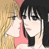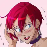
In retrospect, I think Zerina should've taken up more panel space in that bottom panel. The idea would've been she was being very forward and leaning into the camera, but I guess I just forgot what I was trying to do and instead came out with something ultimately rather boring but acceptable.
It's hard to come up with something visually dynamic for every page, particularly when you're just fried.