Tuesday Update 28/01/25
Added 2025-01-29 04:19:18 +0000 UTCHoly smokes, it's that last Tuesday of January already.
And man has it been busy and productive!
Finished So Far This Month
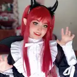
FoF 35 Beta / 38 Alpha, Commentary passes on 14 different QT Spinoff chapters, QTNW 32 Beta / 35 Alpha, AMA Week, Le Francais, Unexpected Affections x2, DM and the Dirty 20s, OFGx2
Q1 Project: Author Website Phase 1 Complete
Wait, what was that Break? Phase 1 already complete?
Why yes, the Break inside my head that talks to me, the First Phase of the Author Website is already done. Not only that, but it's also live and ready for all of you fine folks to take a peek!
Author Website Link: Breakthe.Bar
I couldn't help myself with the domain when I saw it was available but breakthebar.com wasn't.
That being said, I would appreciate it if anyone who is interested would like to poke around, take a read, see if I've messed anything up. Point out any spelling errors I've missed. I'm also VERY open to feedback on design and what other content should/could go up there. Phase Two will be getting a 'Blog' area sorted where I'll be writing some articles about Erotica, Literotica, being a Patreon creator, and other questions I find myself fielding in Erotica Author spaces.
Coming Up Next
Based on the Extra Writing Poll from this weekend, I'm going to spend some writing time in the next few days working on QT: Ontario. I'm not sure how fast progress will be, so expect one collected post for everyone on the 31st.
AMA Arc 1 Bundle Cleanup (251-300, 301-339)
That's all for now, folks! Have a good week, we'll be starting February with a Monthly Update and digging into FoF.
Cheers,
~Break.
Comments
Imo the Break in your head that talks to you sounds like Gilbert Gottfried as Iago in Aladdin
Toastroast
2025-02-03 17:23:12 +0000 UTCI super appreciate this feedback, but I have NO idea how to tackle that specific issue since it isn't happening anywhere else. I'll add it to the list of stuff to research!
BreaktheBar
2025-02-01 05:19:46 +0000 UTCSo on Brave on Windows 11 23H2 the "The Stories" page layout puts the actual stories over the heading para. https://ibb.co/67gFkpwL
Michael Duke
2025-02-01 04:45:18 +0000 UTCI guess it TECHNICALLY isn't, but I don't point anyone towards it on Amazon. That may change when I start looking at releasing other stories in eBook format, but for now the main thing is that it isn't on Literotica or any other free site.
BreaktheBar
2025-01-31 18:59:00 +0000 UTCThank you for the feedback! - Home Page Icon/Titles: Titles are now clickable. The other links on the side are part of the footer for the entire website, so they show up at the bottom of every page. - Bio section: I'll take a look at the 3rd Person/1st Person element of this. Noted! - Contact Page: I didn't feel like a full Contact Me page was super necessary. If folks are looking to contact me, they are likely also checking out the About Me area. I'm putting this in my notes as something to look into more in a 'What is good design?' research way. - Light/Dark Mode: You're the second person to request this - I'll likely make the change because I do like dark mode better too. I'm not sure why I didn't do that from the start. Maybe I just liked the contrast between pages or something. - Favicon: I think that's the Squarespace base icon. I'll look at getting it changed! - Twitter/BlueSky: I do have a Bluesky as well! I just haven't really used it. I also haven't really used the Twitter. Writer-Social Media is already kind of hard to build, and the Doomerism of timelines these days is a bit of a creative suck. Mostly I just don't know what to do/offer in either space at the moment to drive any engagement. I'll add a BLueSky link onto the site for sure though! - Inkitt: Yeah, I currently have chapters auto-releasing for OFG and AMA over there. It isn't exactly a great place for Erotica though (bad discovery options) and my Covers are pretty garbage. I might take another run at it with different covers and switching to Romance descriptions with 'extreme spice' content warnings.
BreaktheBar
2025-01-31 18:57:54 +0000 UTCThanks!
BreaktheBar
2025-01-31 18:44:16 +0000 UTCGreat notes! - Home Page Icons/Titles: Text is no clickable. - Best Read On marketing: Good point. I've noted this and will make the change. - Literotica promo: They have pretty strict guidelines on what you can say in the text in of the stories, and where you can promote. I would if I could, but I can't!
BreaktheBar
2025-01-31 18:43:36 +0000 UTCHmmm, alright. I'm seeing it too when I shrink my window. It looks like Squarespace wants to make it adaptable as opposed to shrinking the image. I'll need to look into this more - I've got it noted! Thanks!
BreaktheBar
2025-01-31 18:37:34 +0000 UTC"Romance for men" is a specific genre. Women who would be interested are likely to recognize that. "Romance" is a genre mostly aimed at women, so if you remove the "for men" bit, most of the target audience goes away.
FlareNight
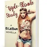
2025-01-30 05:16:28 +0000 UTCI knew I was remembering correctly. Triple Blonde Study is also on Kindle Unlimited (and Kindle itself), which you should definitely list.
FlareNight
2025-01-30 05:00:26 +0000 UTCOn my laptop, your banner image is partially cut off. I'm running 1900x1200 resolution and your 1600 pixel banner is missing about 50 pixels. Banner ends at the blonde's eye.
Jeff Hughes
2025-01-30 04:37:57 +0000 UTCVery nice website. Small thing - the icons at the bottom for "The Stories", etc. are clickable, but the text below is not. Probably best to let people click there as well. Big thing - Your series descriptions all have "Best Read on Patreon" and "Can also be found for free on ,,,". This makes it sound like the only reason to use the Patreon is a (maybe) better reading experience. You should be pushing the actual selling point - the latest chapters. I know you said that in the intro, but not everyone reads that. I'd instead put something like "All chapters available on Patreon" vs. "Early chapters available for free on..." Side Note - There's also no reason for you not to say something like this at the end of your Literotica posts, too. Sell the Patreon! You deserve it!
GWJ
2025-01-29 20:38:54 +0000 UTCIt was released as one post!
BreaktheBar
2025-01-29 16:58:53 +0000 UTCWas UAx2 released as one post or is another one going to be released?
EkacElppaEnip
2025-01-29 15:58:06 +0000 UTCAwesome site looks great!
Psychopuppy
2025-01-29 15:22:28 +0000 UTCI am not sure that you´re "Romance for men" only. With your big focus on consent and communication in every single story of yours i can imagine that women could be interested too.
Darkflint
2025-01-29 13:51:16 +0000 UTCIt's a bit redundant to have the picture links (I concur with HN that the titles should be clickable) and just below to have the three links as well on the right side. Stylistically, the bio section info seems a bit impersonal to my eyes. It feels slightly wrong to be written in third person. I'm a bit surprised that the contact section doesn't have a dedicated subpage (usually is titled CONTACT) and it can be instead found in the Author. No biggie thing but... My eyes will be pretty grateful if you use the style of the Community page (dark background with light text) in the whole site instead of the style used in the other pages (white background with dark text). Personal preference and all of that, of course. The favicon (the icon that appears in the tabs in any modern browser) is the same one that uses the Project Quaranteam page. Maybe it would be a good idea to replace it. ---- Things that I have discovered visiting your website: I didn't know that you have a twitter account. Any chance that you would eventually would add or replace it with a BlueSky account? For a good number of reasons I don't have a X.com account, but I wouldn't mind following you in a less malevolent social media (I'm not sure if that is not a oxymoron but OTOH Elon Musk). Also I didn't know that you have an account in https://www.inkitt.com/ You're literally everywhere, lol.
lostone2
2025-01-29 08:51:31 +0000 UTCIs Triple Blonde Study patreon exclusive now? I had to double check that amazon didn't yank my kindle copy when I read that... :p
HN
2025-01-29 08:28:48 +0000 UTCSince you asked, I'd like an Oxford comma after Peddler on the community page. It really is necessary for clarity, even if we go along with your questionable capitalization. On "The stories" The OFG posting list is also missing its comma, even though AMA is not. There shouldn't be a comma before "but" in FoF, since the second half isn't a complete sentence. AMA is missing the diacritic on fiancée. Also it's been conclusively proven at this point that content warnings are actually worse than people randomly encountering the content. If you want to include a warning, it's better to just say something like "Note, this includes," but usually even better to leave them out entirely. Putting it as a content warning preps people to have problems. I like the bio, but you should definitely use full quotes, not half quotes. Beyond that, I think most of it is in the arena of marketing, which I can't help with.
FlareNight
2025-01-29 04:39:15 +0000 UTCOooh, interesting. Making a note!
BreaktheBar
2025-01-29 04:35:23 +0000 UTCImmediate feedback: looks great on mobile! The only thing i can think of as constructive critique is that the top art buttons in the story branch look clickable and aren't. Might be able to figure out something clever when someone taps on them maybe?
Matt
2025-01-29 04:27:51 +0000 UTC