Behind the scenes + process: Himari
Added 2022-02-01 10:40:03 +0000 UTC
This post documents the process of an experimental piece done last year.
Inspiration
The reason I illustrated this piece is the same as all fan arts: I adored the official work and wanted to make something for it.

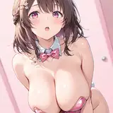
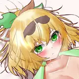
Penguindrum is a Japanese anime series I watched back in junior high. At that time, I liked the younger sister Himari Takakura and drew her a lot in my sketchbooks. Some time ago, when I was watching sakuga MADs, I happened to see this animation again. Hence, I embarked on the journey of illustrating Himari.

I made a rough sketch. The apple holds a great significance in the animation, so in the concept, the wind blows on Himari’s hair and skirt as she is about to taste the apple in her hand.
Collection of references
Based on the existing sketch, I collected the character design and reference photos of the environment and colors.


Next, I used MagicPoser to get a reference for motion and lighting.


The character's clothes are rich in pleats. I can't draw pleats very well, so I chose a photo to assist. (The photo was taken at a playground party, I shot a photo of my friend, and the light source is quite appropriate! :D)

Create a new layer on top of the original draft and do a brief line sketch.

Coloring and lighting

Coloring and lighting under the reference of model and photos.


After the light and shadows are established, a new layer is created below the line art layer for further refinement.


Frustration
And then...uh...this time the process was a little special… I rendered and rendered to the point where I didn’t know what was next.

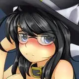
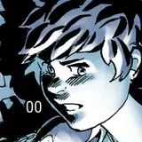
This picture below is the stage of the near completed face. The next stage was rendering her body, and upon the completion of that task, I still wasn’t able to reach a final conclusion…

Did my progress hit a plateau or is this something else? Sometimes, the more I draw, the less motivation rolls in—making it more difficult to finish.
This painting happened to be at this stage, which doesn't seem like a big problem, but the composition lacked dynamic and looked stiff—not the image I had conjured in my mind for the draft.

My mind raced for solutions—but I found that the long hours of drawing had numbed me to not get the feeling of the drawing. The pencil was like a horse out of control, and I couldn't get the desired feeling out of the drawing.
So, I had no choice but to stop drawing.
It sounds like a cop-out...but it's not! This is from my personal experience: in order to gather motivation for a long time to focus on a painting, your eyes would struggle from staring at the piece for too long and get used to it. It’s just like repeating a word over and over again until it loses its meaning. At this time, doing something else to direct my attention to would prove itself helpful.
If you come to the realization that you have consumed a lot of time and you aren’t in a good state, you may want to put this piece of work to the back of your mind. When you open it again after a period of time has passed, your eyes will see the work as if for the first time, and you will be able to perceive more intuitively and accurately how to improve it.
Redraw
I said it's been sitting for a while, but this time it's really been sitting for a bit longer...
The last edit was made in June, and November arrived in the blink of an eye…

But I have to mention that after a few months of it sitting on the shelf, the painting seemed brand new to my eyes.
I intuitively felt that the main problem with the composition was that the refined shape was too rigid and the colors followed the reference photo too closely, which made the whole painting lack impact and spirit.
Making changes to the refined image would only be tiptoeing around and not conducive to bold adjustments, so I rewound the process back to when the base color was first laid down and started thinking about how to improve on it.
After hiding the lines and backgrounds and simplifying the image to just blocks of natural color, I was able to make changes in a more free and spontaneous way. I redrew the hair to enhance the dynamics of the wind, and added many fine strands to give the hair a richer look.


I redrew the shadows with a new look in mind. I adjusted the shadows to a cooler, brighter blue to give the image a stronger impact; the red apples are better emphasized by the contrast of the blue as well.


Color reference
Since the colors were changed quite considerably, I searched again for references with shades of blue.

This time, I tried to let the brushwork relax to not make the composition stiff and rigid.

Surprisingly, the earlier refinements made were not completely pointless. Here, I actually secretly placed the layer of the early refinements at 20% opacity on top of the redrawn image, and the apple was also pasted back directly at 80% reduction—which made the secondary refinement quick and easy!

Then I enhanced the vignette of the image. By spraying the hair in the distance with a blue gradient of the same color as the sky, the hair blends better into the background and the whole image appears more airy.


Merging layers to refine adjustments
The layout is fully completed and I merged all layers for further refinement.


Originally, based on my past experience in shaping, I could have finished this painting with a little more refining for the details.
But whenever I got to this point, I would always want to try something new. I wanted to play with the gray areas with large brush strokes by adding some unconventional and highly saturated colors.
Using procreate's brush 画笔, I applied the pure red of an apple in the area where the light and shadows met, as well as a shade of blue previously used in the skirt’s shadows.


In order to make the vibrant red tone of the apple not stand out too much, I tuned its saturation down using the color balance tool.

Enriching the pleats of the skirt
Although the skirt was drawn with reference to a photo, I still felt that the shape of the skirt in the current picture was still a bit odd.
After showing the painting to a friend, she agreed that the skirt could be adjusted, and mentioned that she had many skirts of her own and would take some photos of the same angle after work for my reference.
That night I received a dozen photos of clearly shaped dresses! I selected some of the photos with more appropriate shapes and perspective and put them on the image for comparison.

Finally, I selected the skirt in the lower left corner, pasted it onto the hem and then recolored it through automatic selection to finally finish fitting it to the image.


The hairy outline of the figure’s upper body was also fixed, and these were underlined by creating a new top layer and drawing the color from the layer below.


Final image adjustment
In the final product, I adjusted the color of the sky and skirt to be more purple toned, and the color of the apples to appear more red. I added a few inconspicuous red dots in the air to echo the red of the apple, and lightened the white of the shirt slightly to make it appear more transparent. In addition, a certain amount of Gaussian blur was applied to the bottom of the skirt to give the image a stronger sense of reality.


So, the illustration is finished~
-
Few years ago, I was very resistant to redrawing or spending too much time on a piece of artwork to adjust it.
But now my attitude has gradually changed. I'm more willing to spend time on refinement and adjustment than to produce a fair piece of work in a short time. Of course, this does not mean adding unnecessary details without thinking! But to think about how the effect will be better, try to reiterate it over and over and even redraw, until you are satisfied.
That’s all! Still sending thanks to my friend Valerie for helping me with the English translations. You're welcome to comment if you have anything to talk about!
See you next time!
Comments
Thank you very much for sharing the process.. is interesting to see that sometimes is better to stop and take a rest... That's also a good tip!
2022-03-04 19:13:23 +0000 UTCThank you! :D
Sheya
2022-02-18 15:48:42 +0000 UTCThank you Lily! :) I usually search for "impressionist" works on Pinterest as references.
Sheya
2022-02-18 15:48:24 +0000 UTCwhere do you usually go to for painting references? the process was very fascinating to read about, thank you for taking the time to make it!
Lily
2022-02-05 08:40:30 +0000 UTCthank you so much for sharing <3 I love reading about what you think or how you solved the problem you face or changing the color it's very helpful and interesting
Daliamon
2022-02-05 06:54:34 +0000 UTCThank you!
Sheya
2022-02-04 09:58:37 +0000 UTCThe color of the picture is getting clearer and more beautiful. Thank you for the post.
iloveyou
2022-02-01 12:50:45 +0000 UTCThank you Milk! :D
Sheya
2022-02-01 11:05:55 +0000 UTCthank you so much for sharing the process! >< its a very beautiful piece as usual!
Milk Tea
2022-02-01 10:58:25 +0000 UTC