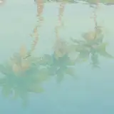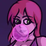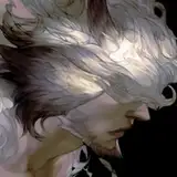
I guess I'm having slow progress to understand how to color my art. Years ago I had gone through similar method with another painting ( you can see the WIP on my tumblr ) but at that time I was really shitty at understanding how value works. And PaintTool SAI is not ideal for dealing with values.
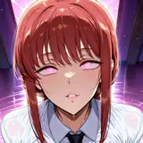
I have tried tons of different approaches on different software, and found out the main reason that make the painting process particularly hard is because I have the tendency to push the complexity of the forms while drawing. Anyway, it seems better for me to not exaggerate everything, and just focusing on making those colors really attach to the subject.
每天打開電腦都在試新招,試到後來想說反璞歸真算啦,把幾年前用過的類似方法端出來再試了一遍。(以前使用類似方法完稿的舊作,可以在我的湯上看到過程圖) 當年我對value(灰度)的概念幾乎等於零,雖說成果看起來還不壞但其實過程遇到非常多問題,加上SAI並不適合拿來處理細微的灰度變化,當時因此就沒再繼續用同一招完稿。今天改在PS上試了一下,感覺顏色終於「黏上去」了(很辭窮只想到這樣表達),過往一直有顏色歸顏色、輪廓歸輪廓的問題,很難營造出我想要的體積感,而解決辦法好像就是...不要過度追求色相或光影變化(感覺好像廢話)
K T
2018-07-12 08:59:08 +0000 UTC