NokiMo
Couch Patrol
Couch Patrol

patreon


Logo (re branding)

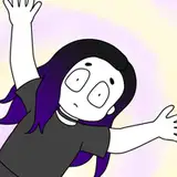
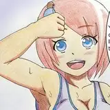
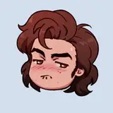
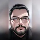
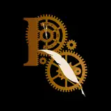
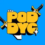
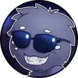
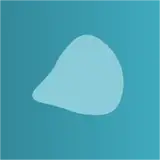
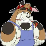
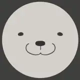
Hey guys we are currently working on our branding, logo and banner as well as some more details around how the videos will look.. if things go well and we keep growing like this we will be able to produce much higher quality videos and..much more of them! Gaming will soon make it to the channel too with red dead redemption 2's group playthrough! What do you think of these logo samples?

Logo (re branding)

Comments

I like the 4th one (the one on the bottom left corner) the best because of the yellow upside down triangle at the bottom that looks like its illuminating the couch. Its the most creative one imo

Ayush Nayak

Thanks Jasmine! Yes, option 3 is the one we liked the most too! Good eye, thanks for sharing your thoughts!!

Chris Petrov

I'm just gonna give my 2 cents, might as well give my input. 1st one looks fanmade (like fake, letters too big and cramped. and the line in the middle just throws the whole thing off), 2nd one is not bad but I think the text looks better curved like the others. 3rd one is my favorite, i just think it's perfect. It's not too much and not too little. 4th one is good too the lasers look cool and adds some spice to it. For the 5th one, I don't like the play button on top, it doesn't blend in to the whole logo. I love the other one like on 3. Number 6 is good too i like the background as well. But I do prefer the lasers more. So for me, I would say 3, 4, and 6 is what you should consider. Hope this helps!

jasminethegreat


Related Creators