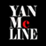
Title design update!
Added 2024-11-15 19:11:33 +0000 UTCHey everyone!
I've been working on some new title designs to help the game stand out more, and I’d love to get your feedback. I’ve selected a few rough sketches that I think are worth considering, but I wanted to hear your thoughts before I put in the time to polish them up.
Check out the options below—keep in mind these are just sketches, and they’ll likely evolve with more detail. Let me know which design feels like the best fit for the game, or if you prefer the current simple font style. Based on your votes, I’ll focus on refining one or maybe do another round with fewer choices to nail down the final look. Thanks for your input!

Comments
I liked the D for staff and sword plus the leafs wings on the T and S also like in second the A for letter styles.
Christopher Dijoux
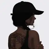
2025-02-10 00:34:38 +0000 UTCI consider the Main character sleezy, not the game pr. say. Sleezy is perhaps not even the right word, perhaps something more skullduggery-like. Perhaps it is because the styles are too clean. He's a lot more underhanded than that. :)
waffel
2024-11-15 23:31:01 +0000 UTCI don't consider it a sleezy game, though. In my mind, it's a serious RPG... that the player has learned to exploit.
Andrew Freeman
2024-11-15 22:27:49 +0000 UTCI think none of them catches the games spirit. It need to look more sleezy.
waffel
2024-11-15 19:42:28 +0000 UTCDefinitely D - best readability, no issues with background behind the text, and works well both as a title and a logo.
David Nguyen
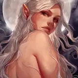
2024-11-15 19:37:15 +0000 UTCI think D would look good with the girls behind it!
Atlamillious
2024-11-15 19:15:31 +0000 UTC