Design shift??? Some of you including Adam might be thinking, why are you making a design shift? The style looks fine! Well it's more of a design refinement than a shift. I was slightly changing my style every time I'd go to make a new character. Some would have more detail while others we're more simplistic. Some would have heavy shading and others flat.
So I've decided to rework some things from the core. That's why I'm starting from scratch so to speak. I'm establishing a consistent design from the beginning so I can maintain it into the color, shading and animations. Make a strong foundation and you can build anything on top.
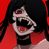
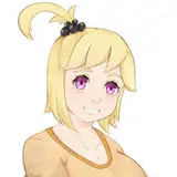
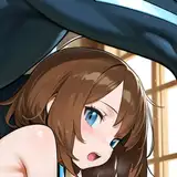
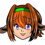
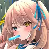
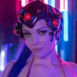
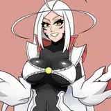
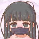
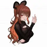
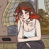
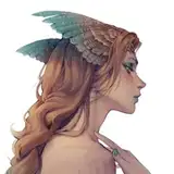
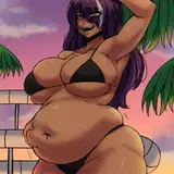
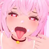
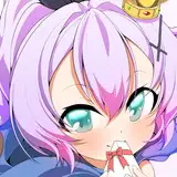
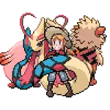
The main thing I took away from this round of sketches was I want the female characters to have a softer rounded face. I want the average female height will be around 4-5 heads tall. ( That's animator speak, we measure height by the size of the head. ) I think it's a good balance so you can see facial expressions more clearly while not going too much into a "cartoony" style. It's walking that fine line.
In terms of overall design, I'm going 'over the top' exaggerated look where I can. I also want the feel of the character, props and backgrounds to have weight. It's hard to explain but I'll be making things have a thickness to them. For example, hair, armor, weapons will have a thick sculpted look. Joe Madureira's art and the Torchlight game's art are a good examples of this. If you look at the hair, weapons, outfits and even backgrounds, it all has a look that has weight to them. Look for this when I begin translating these sketches into cleanup art with color.
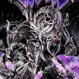
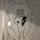
Next time we'll take a look at how this new design shift affects my male characters and monsters!
Akumi
2020-02-19 04:17:07 +0000 UTCFrank O'Rourke
2020-02-19 03:11:27 +0000 UTCMiltonius Arts
2020-02-17 10:33:36 +0000 UTCFrank O'Rourke
2020-02-14 08:40:46 +0000 UTC