A small postmortem
Added 2016-08-19 21:55:33 +0000 UTCJust a list of stuff I need to work on for when I use tones next time.
- Gonna need to make smaller versions of those tones for when I don't need to cover much area. Since the method involves putting the tones on top of where I want 'em and erase/hatch away the highlights I'll need to make things more convenient for myself.
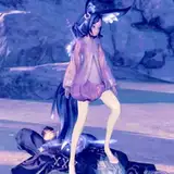
- I'll have to toy with GIMP's Newsprint filter more to see if I can get tones with smaller/more dense dots without those funky patterns showing up when zoomed out (they're called moiré, but I'll just call 'em funky patterns here). Otherwise it'll be hard to shade areas that are supposed to be grey but which are small enough that the current tones would erase a lot of detail (like Terezi's eyes in that last pic - not easy to tell she has an ahegao expression unless you look at the version without tones).
- That said, I did theoretically get something that can be printed out and look fine on paper, so at least there's that.
- Finally, I need more variety in tones 'cause I only have two so far. They contrast pretty nicely and layer onto each other well enough, sure, but as much as I like the really dark look it's also not gonna be appropriate for every pic.
Anyway, regardless of faults I do still like the overall look, so I'll experiment with tones a bit more. I mean, it gives GIMP an actual use on my workflow beyond glorified resizing tool, so that's gotta be worth something.
If I can make this work more reliably, I'll make a mini how-to for creating custom screentones. That should be a thing.