News 06/04/17
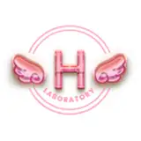
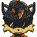
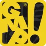
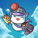
Added 2017-04-06 17:59:44 +0000 UTCFor a long time I did not write anything, I worked too much again. I drew a game logotype. But many of my friends did not like it, write your opinion about it. The development of the game is in full swing, I do not even know what to show you so as not to spoil the plot and the scene. Thank you very much to everyone who supported in March
Comments
As always, thanks for the feedback, in the future maybe corrected. But not now because I think the main component of the game is more important
Cracker108
2017-04-08 14:32:53 +0000 UTCI´m no logo designer but what´s wrong with it in my opinion are the following things: The upper word and the lower word lean in different directions, it works for some themes but that´s not the case here, it rather looks odd to me. The lower word uses different sizes of letters, some are small and some are capital, that´s a bit weird. And the 3rd thing is, the upper word uses lots of curves in the letters but the lower word does not. It uses lot´s of straight sharp lines instead, it looks a bit off to me. I don´t like creating logos myself, it´s pretty difficult...
BabeFactor
2017-04-08 14:11:41 +0000 UTC