The process behind making my various Mega Man robot master designs and redesigns was interesting, so I thought it'd make for a good series of posts for Patreon!
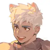
The primary goal for every single one was to, obviously, mimic the design style of official Mega Man as closely as possible. I started by analyzing similar-styled designs to what I wanted to go for, which in Glacier Woman's case were Splash Woman, Tundra Man, Star Man, and Shadow Man.
I started first with the old 2015 design, though for Glacier Woman specifically I also had an awkward, early-2018 design to go off of as well, which is the one between the 2015 design and the new sketch. I attempted this project a while ago, but that was my initial result and I was rather unhappy with it, so I dropped the project back then.
I aimed to stay true to both Glacier Woman's 2015 design but traditional Mega Man designs as well, which affected the entirety of the design. For the most part, not too many details actually changed, though! She still has her helmet, a similar body structure, etc. The main changes are proportional, basing them on the MM11-style primarily (giving her a crotch and legs, adjusting her torso design, and making her neck more prominent). The other major change is her head design, specifically her face and eyes. Mega Man character eyes are diverse but very uniform, and often times this is the place where most "Mega Man-style" comes into play.
The other major differences I had to take into account during the redesign process was the color palette. Glacier Woman's original design had a large variety of colors, ranging from blue-green, lighter blue-green, blue, tan, lighter blue, black, and white. That's a TON of colors, and a lot of them blended together. In character design, especially with Mega Man characters, it's better to stick with a few prominent colors, and save others for small highlights instead. For her new palette, I kept the blacks about the same, made her blues a little less green-tinted, replaced the lighter blue-green & white colors with a single snowy white color, and the blue of her hands was changed to purple. This new purple color was placed throughout the design, making her stand out a lot better. She still retains a cool palette, but it's more interesting to look out now, and is more eyecatching.

Static Man was my next design, and this one was almost completely original. While looking at the old Shock Man conveyer-belt-design, I realized how similar he was to Fan Man, and decided to turn the guy into a more traditional Robot Master instead. Uniqueness isn't uncommon among Mega Man characters, but having two characters with the same unique flair to it just felt like overkill in this set. Plus, I was lacking in humanoid characters anyway.
I used a lot of electric-type Robot Masters for reference, and the first thing I decided upon was using the Dynamo Man/Spark Man-style of eyes. In sketching Static Man's head, I actually just based it on the MM2 Telly enemy initially and moved from there. I added the bolts on the sides of his head at a later point, due to wanting to give the head more weight.
His torso and leg design was based mostly on Elec Man, and his weapon was based on some vague sort of "static electricity machine" that I just googled to see if it existed. It's similar to Dynamo Man's weapon, but that wasn't super intentional.
For his new color scheme, I focused on a simple palette of white, black, and yellow. Whites and blacks are very frequent in Mega Man character designs, so when in doubt, they really should probably wind up in every design somewhere, practically. I gave him highlights of gray, green, and orange in order to accent his design and make him interesting, but the main palette should be the most prominent and obvious/frequent colors.
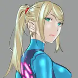
Two of the references I used, though, were for posing purposes. Stone Man helped me out with the fist, since I'm rubbish with hands typically. It wasn't a direct trace, but I did heavily reference it while sketching and drawing. Samus from Smash for Wii U is also there for the leg positions, as I liked the slowly-walking-towards-viewer posing, especially since it fit with my idea to make Static Man a shield-wielder.

Flare Man was third to be redesigned, but he didn't get too much of an upgrade. Most of his changes were posing-wise or slight anatomical changes and differences. His arms have a connection to the body now on a yellow half-circle, one of his triangle shoulders were removed, parts of his arms were made more Mega Man-buster styled, and I attached his propane tanks to him with a belt.
He was also given a crotch area, thanks to Needle Man and Magma Man's designs helping out determine what Flare Man really needed to feel truer to Mega Man-style. I also lightened his color palette, making it feel a bit less saturated and eye-grating.
Since he had a lot of green on him as a highlight already, I decided to use the same colors for his eyes, to avoid having too many highlights on his design.
His fire was based directly on the art of Fire Man from the Rockman Complete Works collection. I vastly preferred how it looked to trying to mimic Magma Man's MM9 art's fire.

The final one for this post, Nature Woman came next. After making her feel very feral and animalistic in her 2015 design, with cat ears and paws/legs, I felt I should probably tone her down a bit and make her feel more robotic again. So, to do that, I looked at references for various animalistic Robot Masters and other robots.
The two that I ended up using the most wound up being Pluto from Mega Man V on Game Boy, and Treble from Mega Man 7. Pluto helped immensely with the head and ears, as well as being a basis for her new tail design. Meanwhile, her legs ended up practically being carbon copies of Treble's design, even down to the spikes on their back (look, what can I say, she already had a spike motif, it just worked too well)
You'll notice that her color palette once again expanded like the others'. Instead of just being green and brown, the brown became a highlight and her primary palette was shifted to just one shade of green (technically two, but they're close enough that it really only looks like one), and additions of yellow, black, and white. See those whites and blacks popping up again? They really do work well, so it's not the last you'll see them get thrown in!
Though, you can't really just throw them in willy-nilly. Blacks are most often used on legs, arms, etc. Connecting limbs, that sort of thing. Whites, meanwhile, tend to be related mostly to hands, legs, or shoulders. If you design your own robots, this is something to definitely keep in mind.
Anyways, I threw in a small blue and red for highlights in her design to round it out. Overall, her palette now is very strong, much better than her old design which tended to blend together.
I wasn't quite sure what to do about her leaf blades initially. I couldn't just drop them, due to them being integral to her design (and a lack of replacement ideas). So, instead, I put a spiked tip on them to make them feel more threatening, and took a design inspiration from Maypul of Rivals of Aether, a furry indie fighting game. She wields similar leaf blades, which are attached to her arms via rope vines. I borrowed that by making the leaf blades weapons for Nature Woman to actually hold onto, as opposed to being just her actual hands. The change makes her design feel a lot stronger and more sensical as a result, and it's really quite simple when you think about it!