Coloring Splash Page Demo
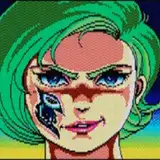
Added 2024-05-13 17:16:00 +0000 UTCYou may remember I posted a splash page art for ISM last month. here's the current iteration with rough color-work done.
I know Nat is maybe a bit too small, but my editor can probably fix that in post rather than bother the original artist.
I dunno if I like the mandrill nose colors or if we should go with something else.
Most everything else is great. I know Boomer isn't exactly as described in the series, but honestly I'm concerned his look might not translate well to images, so I'll favor cool over accurate.
Lemme know what you think.
0.0 I love hyperweave...
Comments
I have a lot to say, and feel free to disregard all of this, but I think Nat looks childish because her head is too big for her body, and Boomer looks like he is right next to Perry, making him look smaller. If Boomer was further away, it would make him and Nat seem bigger. Also Perry's suit is not as dark as I pictured it. Still looks fantastic as is, and the artist should be proud.
Aron Coxall
2024-05-14 13:57:06 +0000 UTCLoving heather!! Woo!
Hayden Leech
2024-05-14 06:05:40 +0000 UTC