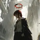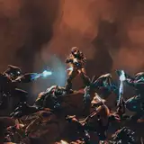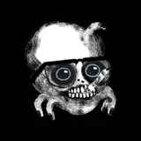
Just messing around. Trying to do an “action scene.” I can’t say I’m in love with working with Screen Tones so I don’t think I’ll ever being doing them that often. But I wanted to go for a manga look. And I went through a couple different ideas for how to pace this.
Pacing in comics is a very weird thing. The size of the page and panel changes the pacing. The number of panels changes it. Any dialog or text you can read, changes how fast you go through the page. Choosing what moments to focus on is different than how you would frame it for a movie.
Panel 3 here, you can see in the “blue line” page, which was how I originally drew it, I wanted to draw the tentacle lashing forward. It was a dynamic visual, but I didn’t think that worked so well for the timing and the impact panel. A lot of my favorite comic action scenes focus on the wind up and the aftermath. They actually tend to skip the moment of impact.
This sorta alchemy doesn’t really have ”right answers” but there are lots of solutions. You just gotta pick one and make it work as well as you can.
(also, hate to spoil it, but I’m not planning on doing another one of these pages for Resident Evil 3. I haven’t even gotten to play it yet since my PC is still dead!)
Davin Long
2020-04-08 21:15:09 +0000 UTCScarySerum
2020-04-04 15:23:30 +0000 UTC