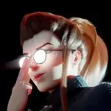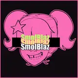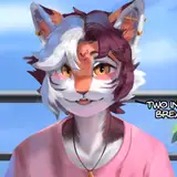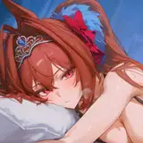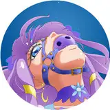
Which store page art do you like more?
Added 2025-03-11 09:11:56 +0000 UTCRemember that this will be a pretty small icon on Itch. I may or may not include the "v1.0.0" on either one, so don't let that affect your preference.
Option #1
 Option #2

Comments
Option 2 but I would love to help you find a better font that suit SS more... Something more fantasy looking/slightly evilish... Pretty sure I can find something...
Asia The Magical Gurl
2025-03-12 00:17:22 +0000 UTCI think first one is better, cleaner, but it is a bit wierd not to have mc. I agree with Kalter about text, it should be bigger and closer to the center, so it will be more visible. On other hand I don't agree about dual portrait. To me it looks kinda cramped and not natural, as if you just placed one picture over another (which is probably the case), I can go in a little more details if you want
Nagise Avan
2025-03-11 18:10:05 +0000 UTCA mix of both? The dual portrait is good, but the pink text from opt 1 is good. The plain white text stuck in the corner on opt 2 just looks off in comparison
KalterJager
2025-03-11 15:06:33 +0000 UTC