Help some Funny Brothers settle a merch design debate.
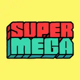
Added 2024-11-08 01:09:18 +0000 UTC We're working hard on getting Black Friday ready to go, and wanted to drop a beanie. The logo on the beanie will be embroidered. Which one is your favorite? Thanks goofsters!
Comments
hey supermega when are yall gonna respond to peoples missing sticker emails?? we gave yall money!
Peyton Gates
2024-11-16 22:18:04 +0000 UTCIf y’all made a bucket hat I would be all over that shit
Monkeys Man
2024-11-09 12:21:41 +0000 UTCWtf why is 1 number 1. Other two are way better
Lukas Montgomery
2024-11-09 07:52:55 +0000 UTCEither 2 or 3 100%
James French
2024-11-08 20:55:53 +0000 UTCLiterally a screenshot of this message
Bo
2024-11-08 20:31:13 +0000 UTCPut me on the beanie thats my suggestion it will sell millions
Lonavo
2024-11-08 19:34:52 +0000 UTCBottom of 1 with top of 3
aidan gillie
2024-11-08 18:33:51 +0000 UTCEven though 1 ran away with it, 2 or 3 incorporate the new branding better, whereas 1 uses the new font with the old logo
Joe McKenna
2024-11-08 14:30:23 +0000 UTCiThink you're actually right, the 2nd one lookz more stylish, the 1st more nostalgic iAlways prefer merch that isn't just a company logo, or brand advertisement — æsthetixXx, like CoolShirtz
𝔻𝕖𝕒𝕘𝕒𝕟
2024-11-08 14:20:37 +0000 UTCI love all of them, but 1 is so nostalgic <3
Dilloid
2024-11-08 13:42:46 +0000 UTCTwo is my favorite. It’s the most relevant style to current SuperMega.
JiggyHead117
2024-11-08 07:39:32 +0000 UTCa DS game would be some cool merch tbh
N_O_Portal
2024-11-08 07:01:43 +0000 UTCLove 2, it's like a redesign logo for this newer era you guys are on.
Nic Barb
2024-11-08 06:53:46 +0000 UTC1 is a classic but 2 is a lil *zazzy* and I like it
LuciferLexxx
2024-11-08 05:53:41 +0000 UTCNumber 2 by a long shot
ice9
2024-11-08 04:50:21 +0000 UTC1 is the classic but rebranded
Jalen Cene
2024-11-08 04:49:05 +0000 UTCog is where it's at brothers, two just doesn't fit your whole brand.
CenobiteTacos
2024-11-08 04:21:50 +0000 UTCit seems everything I vote for loses these days...
Noodle
2024-11-08 03:53:26 +0000 UTC1 all the way, classic supermega logo is where it's at
Hennee
2024-11-08 03:45:03 +0000 UTCjustice for 3
roalif
2024-11-08 03:18:59 +0000 UTCI choose… yo mama! Gotcha!!! 😂😂😂😂
Kooey
2024-11-08 03:17:42 +0000 UTCI'm a sucker for the all caps in 1, though I really appreciate the offset look in 2 as well.
Fritz Wulfram
2024-11-08 03:06:37 +0000 UTCOG LOGO 4EVR SWEETHEART
𝔻𝕖𝕒𝕘𝕒𝕟
2024-11-08 03:05:54 +0000 UTCI like 2 a lot conceptually and I voted for it but I think it hits a little weak compared to the other ones.
DJT
2024-11-08 03:03:01 +0000 UTCI like the all lower case in the second one!
Daniel Berry
2024-11-08 02:57:41 +0000 UTCI like the one that says super mega
Benjamin Berry
2024-11-08 02:55:26 +0000 UTCNow I require SuperMega beanie
Carpetstain
2024-11-08 02:49:39 +0000 UTCThis is like, the most important vote I've contributed this week!
Maeor Brown
2024-11-08 02:43:13 +0000 UTCThis is the worst vote outcome I’ve seen all year!
Adrian W.
2024-11-08 02:37:55 +0000 UTCthat settles it, upper case super lower case mega
Artemis Hartoon
2024-11-08 02:17:17 +0000 UTCgonna scare the americans with that one
miles
2024-11-08 02:11:53 +0000 UTCfirst one feels more classic supermega, the third one feels more modern somehow, very sleek
Judas Valentine🕺
2024-11-08 02:00:00 +0000 UTCOh hell ya tuques!!
Kowyn Hibbert (Warrior of the Rusty Wrench)
2024-11-08 01:59:45 +0000 UTCshould mention these designs are not final by any means, more so just mockups of concepts. The final design will be proportioned correctly
SuperMega
2024-11-08 01:47:31 +0000 UTCOh hell yeah funny brothers
Cameron Blake
2024-11-08 01:46:57 +0000 UTCtried it, the line in the lowercase "p" hangs down which gets in the way if the MEGA.
SuperMega
2024-11-08 01:46:25 +0000 UTCNo, that's Truck Sim
SuperMega
2024-11-08 01:45:36 +0000 UTCIs this the big project?
Cameron Blake
2024-11-08 01:40:01 +0000 UTCI’m always in the minority on these. Can’t believe SuperMega is oppressing me like this
Shrek2onDVD
2024-11-08 01:33:04 +0000 UTCHow about two beanie where it's the faces of either Matt or Ryan that can work as masks so we can commit heinous crimes with your likeness while keeping our own anonymity?
nathan fuller
2024-11-08 01:22:51 +0000 UTCSuperMega bouta make me go broke bruh 😭
Seth Wallace
2024-11-08 01:22:45 +0000 UTCI prefer the one that says Supermega
Gustavo M.
2024-11-08 01:21:01 +0000 UTCFuck I love beanies
NaughtyDonk
2024-11-08 01:16:36 +0000 UTCLowercase super all caps mega
Kameron H.
2024-11-08 01:16:20 +0000 UTClike just slightly. i really like 3 tho it’s cute. 2 is iffy for me cus the off centered nature. final answer i like 3 most
marissa
2024-11-08 01:16:12 +0000 UTCi like that number 2 is different than what we typically see the logo as. we’ve had so many straight across, top and bottom (shut up) logos on merch over the years, i think it’s time to shake it up a little!!
miles
2024-11-08 01:13:49 +0000 UTCAlso #2 reminds me of the Gamecocks hat I have so go Gamecocks
Tyler
2024-11-08 01:13:47 +0000 UTC1 is the best imo, nostalgic & recognizable. 2 is also good & is more on rebrand
Michael
2024-11-08 01:13:46 +0000 UTCThe mega is definitely to tall on the first so I picked 2
milksteak
2024-11-08 01:13:40 +0000 UTCLove No. 2 it’s more minimalistic 🤙🏼
Tyler
2024-11-08 01:13:02 +0000 UTCNeeds a little green fart cloud
Mancheno
2024-11-08 01:12:33 +0000 UTC1 if the mega is less tall
marissa
2024-11-08 01:12:30 +0000 UTC1 is so classic gotta go with it, but 2 is also eye catching
Bell Pogue
2024-11-08 01:12:20 +0000 UTCsorry supermega but im starting to feel like my vote dont really matter anymore
Nicaskitt
2024-11-08 01:12:02 +0000 UTC2 gives me convenience store vibes which I’m down with.
John Doors
2024-11-08 01:11:59 +0000 UTCWell well well if it isn't my favorite funny brothers. 1 is definitely my pick, looks neat
Toro
2024-11-08 01:11:58 +0000 UTCFirst one seems like the best one
CoreyRex
2024-11-08 01:11:51 +0000 UTCImma stay with the classic
Cristofer Antunez
2024-11-08 01:11:44 +0000 UTCGotta go 1, but 2 is close second to me
Mike_c14
2024-11-08 01:11:37 +0000 UTC1 goes as hard as me when your mom
fatgayuncle
2024-11-08 01:11:23 +0000 UTCYo mama (gottem)
Darren M.
2024-11-08 01:11:09 +0000 UTCHOLY FUCK IVE BEEN WANTING THIS FOREVER I WILL BE COPPING
GoontasticFreak
2024-11-08 01:11:04 +0000 UTCPLZ 1 I like the boxy font and all caps
087Alfred
2024-11-08 01:11:01 +0000 UTCThe first one screams supermega
Mayfield
2024-11-08 01:10:57 +0000 UTCHad to hit ‘em with the classic
goooooooooob
2024-11-08 01:10:43 +0000 UTCNumber 1 gives the best Vibes
N_O_Portal
2024-11-08 01:10:30 +0000 UTC