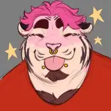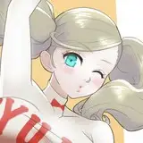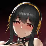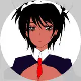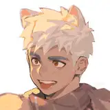
This can be use as a quick guide to all my coloring works with only a few minor differences. I usually have a lot more textures to my characters ( but due to the number of characters in this piece, I decided against it unless the said character is usually a high-resolution CGI characters (Gogo and Honey Lemon). This small change also influences how I approach my flats. I usually would not hesitate to color the overlapping section of my flats differently than the final color to help isolating the section I'm working on, especially when adding the different texture. But since I don't have to do it here, I simply relied on the linework to help me do the selection. It is quicker this way even if less precise.
1-2- The first step is to create the flat layer. This will be my base layer. As I said before, this time around I'll work directly with the final colors. But sometime, this layer has some funky colors :P I'll use the silhouette layer ( titled "s") that I created at the end of the line work process, as my base to mask the section I want to color. This will ensure a final flat layer that is pixel perfect aligned to my linework.
When coloring, I simply select the section I want to fill and use the rectangular too to fill it in with my selected color. I know there's a keyboard shortcut that would alow me to fill it instantly, but I can never remember the damn thing :P
I'll use several layers to create the flats, the next one always under the prior so that I can overlap my selection without the fear of ruining what I have already colored. Once all my flats are in place, I'll simply merge them all on one layer and delete my silhouette layer.
3-4- Now come the time to create my textures. Again, this time around there's not a lot of them so, it's quite simple. I copy my Flat layer and put it in a group called "Texture". Usually I would add a layer this called "Colors", or "C" (I tend to name my layer with single letters when no one else need to work on them) when I would redo the flats with the final colors, than layers after layers of the different textures I might use. But none of this in necessary here.
The only extra layer of this texture group is a different cloud layer that I use to add some randomness to the colors. I found that it helps making the character more alive by crating several little patch of soft shadows in random places. This layer is bigger than the character, so I can move it around until I found a spout where I like where those shadow fall.
When applying a texture, I tend to pour the layer in Soft Light mode and play with the opacity until it's just right (20% is usually what I use for this clouds thingy.)
For a more complex textured model, I would than make a "Bright Objects" out of this group, in case I needed to come back to it later on, but in this case I simply merged it.
Why going through all of this instead of just 1 layer of clods you may ask ? It's simply habits. If I had used multiple textures, turning them on and off while working would necessitate several clicks. Now I just need to turn on or off one object/layer.
5-7- Coloring the lines
Just as I did with my flats, I might use several layers stacks on top of each others to color the lines. I tend to start with waver need to remain black. Overlaying it red for clarity and turning off the overlay once I'm done. Again I use the lasso tool and the rectangle tool to fill the colors. It's a fairly simple but tedious process. The result is always worth it.
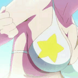
8-9- I almost always color my lines with a darker taint of the overall color of the element I'm working on. And due to habits I can, now a day, pick this color out of hand. But sometime, when I'm not sure what color to chose, I'll use the exact same color as I did the element (the white armor ), and play with the level until I'm happy with the contrast between the two.
10- here's a quick glimpse of the color layer when not clipped to the line.
11- and here was supposed to be the final colored linework, but apparently I forgot to take a screenshot of that. Oups!
12- Time for the rendering. I usually star by turning off the texture layer, but this one is so simple, I didn't bother with it. I also always add a layer called "G" (I can't remember the signification of the letter, but it made sense at the time.) that is a big pinkish-grayish square applied over everything at 80% opacity. This neutral look helps me apply the lights and shadows without being influenced by the different colors of the base model while the 80% opacity help me remember what's going on under it, so I can keep that in mind while working. Again, this one is so simple I could probably do without it, but I still do it out of habit.
13-14 On a layer called "I" ( "I" is for "Incrustation", which mean "Overlay" in french) I'll apply my first layer of light. Using the lasso again, but with a round soft brush to apply it so I can play with it a little and give it just a little bit more volume as oppose as if I was still using the scare tool to apply it evenly (as I use to do way back when). This light is simply a layer of white, but I can sometime use tinted lights depending of my needs.
15-16 When I need some discrete reflections I'll work on a secondary layer ( that I'll merge with the main one in the end) at 30 ish % opacity to paint it in.
17-18 Once all the main lights are in, I'll merge those 2 layers, apply the Overlay mode to it at 60% opacity
19- On a new layer, I'll apply the high lights. I'll use my main light layer as the base for the mask you see here. This mask allow the to easily apply the highlight over the light that I've already drawn in. so there's no weird overlays.
I'll than apply the same mode ( overlay, 60%) to this layer... but I forgot to do it right away, so I'll fix that later on.
If necessary, I would than add a layer of hard shadow, using a dark red, on a layer called "O" ("ombre", "Shadow" in french) in multiplied mode at 40-50% opacity, but it wasn't necessary here.
20-21 This is a weird one. that look unnecessary but is clearly something that is missing when I don't do it.
Over the whole thing, I'll apply a gradient of the same color I would have used if I had to paint in the hard shadow (layer in multiply at 60%). I'll start in the corner the further away tom the light source and go toward the light source. Sometime I'll even warp it in a weird circle thing to envelope my elements. This will give the final element, a little bit of volume.
I'll copy the same layer to apply it on the linework. Sometime, I'll raise the opacity a little, but it's rare. Again, it doesn't look lime much, but when I don't do it, the character always took a lot more flat.
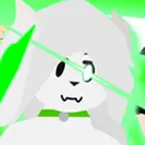
22-23 Since this that place next to an electrocution scene, I needed to add just a bit of colored highlight to the character. There are several way to do it, but I kept it really simple here. I made the whole character as it is at this point into it's own group, on which I clipped an other light layer called "y" (yellow) and roughly painted on the glow of the electricity. I used the "pin Light" mood at 50% for this one.
24- Added in a drop shadow... just a little bit of soft black at 50% opacity. I would usually use the same Dark Red as the dark shadows ( in multiply mode at 50-60%), but since the character will be copy paste in the final scene that mode would not applied and I would end up with a weird red shadow instead of something more natural. so doing it black simplify everything and since those characters are cartoons, it fit the piece.
25-27- This is when I realized I hadn't finished with the highlights. So I first applied the overlay mode to the layer. Than, under all the light layers, I added a new layer called "WH" ( white). This is something I started to do when I paint gold. a small patch of white at 20% opacity under the highlights, that will pive it the soft diffuse look of gold, instead of making it simply yellow. I don't need to be precise here. if fact it help when there some bleeding in the darker section of the gold.
28- Finally, I apply the hard highlights, little round dots of light in the eyes and on the jewelry, as well as a small flairs here and there. I don't remember when or where I found this brush. it might even be in the photoshop starting pack for all I know, but it is quite useful for stuff like that.
29. Here's the final result. that I'll copy paste in my final scene.
Why copy paste you may ask? Why not work directly in the said scene?
WEIGHT. as it is, the final scene is massive. Over 3 gig. Opening it takes several minutes every time, same with saving.
All my elements are on different layers so I can slide things around if necessary. You've seen how many layers and smart objects there is in one simple element. you can imagine how impossibly heavy the final file would be if I also kept all the work layers in there. I'm not even sure my computer could handle it.
So I'm working on smaller, more manageable packages
Hope this was a little bit interesting.
Sorry for the typos, Scribbens seems to have given up midway though this text :P
See you all soon!
Alx
Sven M.
2024-11-06 21:12:16 +0000 UTC