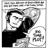
Looking back on things I hadn’t hand lettered, I really wish I had… but I wasn’t getting paid enough to do it here for sure. As it is I had to talk the writer out of doing different fonts and text sizes for every word balloon, which would have been very chaotic. It might seem like a fun and original idea in the moment, but comes off as pretentious and amateurish at the same time when viewed with some detachment. There’s actually fairly agreed upon standards to lettering in comic books that really aid in readability. You can break them all you want in the underground world of abstract and impressionistic comics, but that isn’t what this book was going for and I had to insist that we be “normal” in this area. I compromised on a few things and he had a layout designer change some after I turned the finished pages in, but whatever. It is what it is.
TomQ
2023-10-17 09:45:05 +0000 UTC