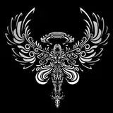
So it seems that we have a winner, #2, SURTUR.
Pictured above is that tattoo that I mentioned I had done of the design. I am pretty sure I won't be sticking to this color scheme... I like to use mixes of complimentary colors in paintings, and exprerience has taught me not to do this so much in tattoos. Unfortunately, tattoo inks do behave exactly like paints, and mixing up muted colors out of cmplimentary colors can be tricky.
Anyways, I'll be posting updates as the project progresses!
Dave Davenport (dogspunk)
2016-11-30 22:36:01 +0000 UTCJohn Stryker
2016-11-30 13:10:49 +0000 UTC