Here's part 2 of my process for my Flower painting! Part 1 was just posted.
Here’s some information about the process videos:
It has been sped up by 250%, so 2.5 times the original speed.
This painting session took me about 5 hours.
I mostly used the hard round brush from my own brush set to paint this. I also used a ‘soft smudge’ brush to soften the edges. I got this brush from Yuming Li’s set that I got when I signed up to their Patreon. I also created some brushes for my most recent tutorial on soft blending which have a similar effect - just scroll to the bottom of that post to download them!
This is painted in Adobe Photoshop. You can replicate a similar workflow in Procreate, with the exception of the gradient tool and the number of layers used!
I also recorded some of the process with my phone to create reels / tiktok videos from. I compiled those together as well - I’ll be posting that after these two process videos!
Here are some helpful resources that can help understand this process in more detail:
Tutorial // techniques for soft blending: This tutorial is about the exact workflow that I use in this process video. It talks about how I alternate between lasso, gradient, brush and smudge tool to create a soft blending style. It also talks about how I layer detail gradually and carefully, and focus on different design elements at different stages.
Soft & hard edges with the lasso tool: This video discusses how to balance hard & soft edges, and control softness by creating selections.
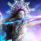
A SLOW PROCESS
This second half of the process is all about finalizing the painting. Design-wise, it’s 90% done at this point, but finalizing is a slow process and this takes half the total amount of time I spent on it. So basically 50% of the time is being used to do 10% of the work! That’s because this phase is all about assessing where the detail is needed, and treading carefully. You’ll see me zoom in and out a lot, because I’m checking the drawing from a distance to see if the detail is working. A lot of the time, it can look good up close but terrible from afar - so this kind of ‘checking’ is a really essential part of making sure that any detail I add is in balance with the rest of the art!
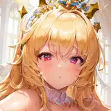
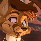
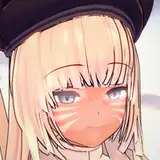
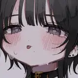
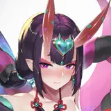
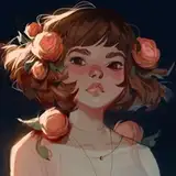
RENDERING THE FLOWER
At a certain point, the face is more rendered than the flower - which means it’s time to shift my focus to the flower. I want the painting to be consistent, so it’s important that the flower has a similar softness and iridescence to the face. That’s why, at 16:43 minutes, I copy/paste the drawing onto a separate canvas and leave it open on the left side. This allows me to use the rendering on the face area as a guide for how the flower should look, and also pick colors from it. A general trick I find useful for rendering flowers is to focus not on the petals themselves, but on the edges of the petals. By boosting the color contrast and lighting along those edges, the flower looks like it’s glowing - which is exactly what I’m going for!
EXPERIMENTING WITH DECORATIVE ELEMENTS
I knew I wanted some decorative elements on this painting, and that I wanted them to be white. I feel like that helps establish the light iridescent feel I’m going for, and contrasts well with the dark eyes. I’m not sure how to approach it, though. Do I want thick shapes, round shapes, or very thin ones? In the end, I feel like thin lines really do the trick. I think it emphasizes the delicate feel of the character. When adding decorative elements, I always recommend puting them on a separate layer so you can experiment as much as you want! That way, you can make sure that whatever you add is an enhancement to your painting.
I hope you enjoyed the process! I also recorded some of the process with my phone to create reels / tiktok videos from, which I compiled into a little process video. I’ll be posting that in a minute!
Loish
2025-08-21 12:15:56 +0000 UTCCayce Goldberg
2025-08-20 12:54:24 +0000 UTC