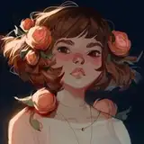
This month, I decided to put together the process video for my Flower painting! I think it’s a great example of how I layer on color transitions and soft edges very gradually - and a good companion process video to this month’s tutorial, which is about soft blending.
Here’s some information about the process videos:
It has been sped up by 250%, so 2.5 times the original speed.
This painting session took me about 5 hours.
I mostly used the hard round brush from my own brush set to paint this. I also used a ‘soft smudge’ brush to soften the edges. I got this brush from Yuming Li’s set that I got when I signed up to their Patreon. I also created some brushes for my most recent tutorial on soft blending which have a similar effect - just scroll to the bottom of that post to download them!
This is painted in Adobe Photoshop. You can replicate a similar workflow in Procreate, with the exception of the gradient tool and the number of layers used!
I also recorded some of the process with my phone to create reels / tiktok videos from. I compiled those together as well - I’ll be posting that after these two process videos!
Here are some helpful resources that can help understand this process in more detail:
Tutorial // techniques for soft blending: This tutorial is about the exact workflow that I use in this process video. It talks about how I alternate between lasso, gradient, brush and smudge tool to create a soft blending style. It also talks about how I layer detail gradually and carefully, and focus on different design elements at different stages.
Soft & hard edges with the lasso tool: This video discusses how to balance hard & soft edges, and control softness by creating selections.
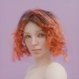
STARTING FROM MY SKETCHBOOK
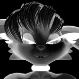
I had already made some dark themed chromatic aberration studies (this one and this one), and I was wondering how this would look with a lighter base color. How can I capture the iridescent and slightly out-of-focus look of chromatic aberration from a lighter silhouette? I had been thinking about this for a few days, and finally took the leap with this drawing session. I start by taking a sketch from my sketchbook as a starting point. That’s because this drawing was all about testing a kind of rendering style, and I wanted to jump straight into it - without having to generate a whole new idea or sketch! I just want to jump right in to experimenting, without thinking too much about what I’m painting.
BRINGING BACK THE CONTOURS
I jump straight into the process by layering on gradients, soft brush strokes, and glowing effects. For me, working quickly is a good way to get my idea out. If it takes too long or the process is too tedious, I lose the momentum of my idea and get bored - so for the first part of this video, I’m just going full steam ahead. However, at about 15 minutes in, I feel like everything is getting too soft and blurred. I’m losing the structure of the face and the features. That’s why, at 16:25, I start painting in some clearer contours around the eyes. At 17:34 minutes, I also start working on the overall face structure. By 18:50, I feel like I have brought back some contours and definition to this character and that she’s less “lost” in the blur. In doing so, I made a lot of changes to her features, but I feel like these work better with this character! This is always what happens when I paint in a soft style: I have to alternate between soft and hard in order to make sure I don’t lose the details.
LESS IS MORE
This painting is meant to be very soft and light, so I try to exercise a lot of restraint with the darker tones. I want her eyes to look kind of like an iridescent eclipse - super dark with bright colors leaking along the outsides. Any other dark tones I add will compete with those eyes. However, at 43:40 minutes in, I feel like this painting is lacking sharp shadows: the 3-dimensionality of the flower is not as intense as I’d like it to be. I start carefully adding some black shadows, using the lasso tool, gradient and brush. I try to make sure that the edges are saturated and bright so that it doesn’t cause muddy midtones. This is something I do by adding a cobalt blue edge to these shadows on a separate layer below. Because these shadows are soft and not too intense, I feel like they work really well and actually boost the drawing a lot! This is why I like being really gradual in how I build up the contrast: sometimes the only way to know if a certain level of contrast works is to add it later on, when other details have already been established.
The next video is coming right up - check out the feed to see it!
Loish
2025-09-01 10:58:17 +0000 UTCMichael H
2025-08-27 14:31:19 +0000 UTCMichael H
2025-08-27 14:27:20 +0000 UTC