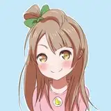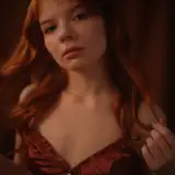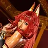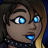
For this month’s process video, I wanted to share the process of my Valentine’s DTIYS! I feel like it might help those of you who participate in the challenge, and I also think it’s a good opportunity to talk about how I go from greyscale to color - a workflow I don’t often use, so this video can help understand my techniques for doing that.
Here’s some information about this process video:
It has been sped up by 250%, so 2.5 times the original speed.
This painting session took me about 2.5 hours in total.
I mostly used the hard round brush from my own brush set to paint this, as well as the MaCaLabs HB Pencil brush to sketch.
This is painted in Adobe Photoshop, but the same workflow can be applied to most digital painting software, with the exception of the gradient tool which I use in the rendering stage of this video.
Here are some helpful resources that can help understand this process in more detail:
Creating interesting & flowy shapes: This tutorial talks about how you can approach shapes in a way that is expressive and dynamic. Shape language plays a huge role in this study, so this tutorial can give some insight into the ideas behind them!
Soft & hard edges with the lasso tool: This is a technique I use a lot for this process, and this tutorial runs you through it and also provides a short demo for how you can mimic the same effect in Procreate.
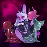
SHAPES
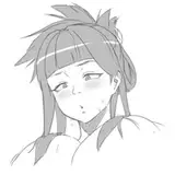
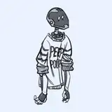
My idea for this sketch was to do something with a character and a heart, but it took me a while to land on the right sketch. That’s because none of the sketches I was drawing early on really ‘clicked’ for me, until the third sketch at 4:23 minutes in. I liked this one because the shapes felt more flowy and expressive. Because the sketch was a lot about the shapes, the next step was to block out the silhouette and work with high contrast values - which I did by blocking in a black background, making the character silhouette white for maximum contrast. When it comes to shapes, I feel like this is the most effective way to bring them to life. The sketch alone doesn’t convey these shapes clearly enough and bringing in more contrast makes them more visible and clear to see. That’s why I moved from rough sketch to high-contrast greyscale fairly quickly in this process!
TESTING OPTIONS
I find digital art so powerful because you can test out different options and variations endlessly! For this drawing, I wanted to make the silhouette more complex and interesting with the hair - but I also wanted it to frame the character and really bring everything together. I didn’t know how I was going to do that, so at 6:48 minutes in, I create a new layer and start testing different options. I do this by taking my hard round brush and just doodling until I land on something that feels right. Sometimes you just don’t know whether something works until you see it in front of you! I end up blocking in a fairly simple hair shape at 10:31 minutes in, and decide to fill up the rest of the empty space with some flowers at 11:04 minutes. This way, most of the shapes in the drawing are round and dense, which I feel works well together.
GREYSCALE TO COLOR
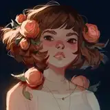
I usually start my paintings with color right away, because I feel like that leads to a more vibrant and unified color scheme. However, sometimes I start in greyscale and add color. When using this workflow, I keep the colors very minimal and subtle - I feel like that creates an interesting visual effect to balance out with the black & white elements! I often add pink/orangey highlights, which is something I learned from doing the Inktober challenge where I started with a pink colored pencil for my sketch. The combination of greyscale and pink always appealed to me.
For this drawing, I introduce color by first using selective color to give a slight color tint to the values (13:08 minutes). Then I add a pinkish glow to the heart (13:25 minutes in), which establishes the accent color. I use an overlay layer to distribute more of that pinkish color around the character (13:50 minutes), and then I change the color of the sketch lines to that same pinkish hue (17:41 minutes). The general idea is just to slowly introduce more color to the painting as I go - which is how I end up landing on the final result!
I hope you enjoy this video, and as always, feel free to ask any questions you may have after watching it!
SabrielleMelodies
2025-03-26 18:38:35 +0000 UTCLoish
2025-02-24 15:19:56 +0000 UTCLori Sunrise
2025-02-21 15:28:14 +0000 UTC