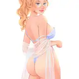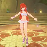
Here is part 2 of the process for my growth painting! Part 1 is here.
Some basic information about this process video:
This is part 2 of 3 parts in total.
The process has been sped up by 350% - so 3.5 times the original speed.
This painting took me a total of 10 hours to make.
At this stage, I mainly used the hard round brush from my own free brushset to blend and paint.
Some things to keep in mind while watching this video:
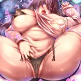
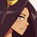
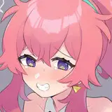
STRUGGLES WITH THE FACE
In this process video, you can see that I change the face a number of times. It was a huge struggle for me to get it right because of the difficult angle. She's looking down and I really want to show that connection between her expression and her hands. But I kind of got lost in the technical aspect of drawing the head from this angle, and in my pursuit of making it look ‘right’, the face would become too detailed. That's what happens very quickly with me when I'm trying to get something "right“ - it becomes overly detailed and kind of restrained. As soon as I looked at the thumbnail view in the top right corner, I saw that the face wasn't adding anything to the drawing and was in fact weighing it down. It often looked too heavy or dense or too dark - basically distracting from the flow of the overall painting. Finally managed to get it right about 34:17 minutes in: I bring back an older version of the face and just focused on the general flow of the shapes around her face, rather than trying to get it ‘right’. I kept her features more simplified and stylized so that they didn't feel heavy or dense. In the end it finally clicked and I felt like the whole painting was working again! I'm a big proponent of changing and fixing things in your painting as much as you need to in order to make it work. It can be very frustrating to get stuck on one aspect like this, but it's worth it once you find the right solution. Especially with things like the face, it has so much impact on the overall painting and it's worth spending time to get it right!
IRIDESCENCE / COLOR BLENDING
As I was rendering this painting, I noticed that as soon as I was detailing areas that consisted of just one hue, it started to compete a lot with the other colors and it felt less blended together. I soon realized that the colors worked a lot better when they had softened edges and were blended with other colors from the painting. A good example of that is when I start rendering the hair around 39:30 minutes in: I soften the edges and I bring in a lot of other colors, like some soft purples from the background, some reddish hues from the skin, some deeper greens from the plants, and so on. Basically, I realized that blending the colors together in this way created a kind of softness and iridescence that made the drawing feel more alive. Once that clicked for me, I started using this approach on a lot of other elements as well. I start rendering the plants and bringing in some of the skin tones to certain parts of the plants so that it looks like they're all reflecting off of one another or absorbing each other's energy. In general, it's always a helpful trick to distribute the colors that are on your canvas all around your painting in interesting ways. It makes everything feel more unified and more vibrant!
Part 3 is coming right up!
Toni
2025-01-11 18:19:49 +0000 UTCLoish
2024-05-28 07:41:23 +0000 UTCmangoburn
2024-05-25 02:54:59 +0000 UTC