NokiMo
Loish
Loish

patreon


TUTORIAL // colors: common mistakes

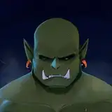
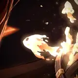
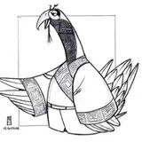
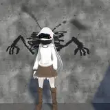
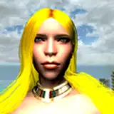
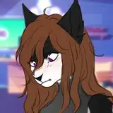
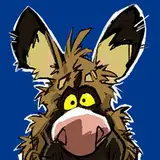
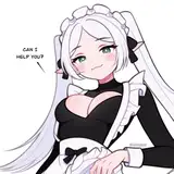
Apologies for the long wait, lovely and patient patrons! Here is this month's tutorial ~ it's on common mistakes when choosing colors! In it, I talk you through some principles and techniques and then do some paint-overs of your submitted art to demonstrate them. Thank you so much to everyone who sent in their art, and a big, big thanks to Olli, Leeloo Wolf, Antonia, Juliana, Léa and Noodles for letting me paint over your artwork for this tutorial! 

As always, here's a cheat sheet with the most essential information about this tutorial. There's also a PDF version with clickable links at the bottom of this post.

Here are some additional videos that you might find helpful for understanding color:

The subtitled version is coming up as soon as the subtitles come in ✨ that will probably be tomorrow or the day after! Again, thanks so much for waiting around for this one and I truly hope you find it helpful! ❤

TUTORIAL // colors: common mistakes

Comments

hey! unfortunately i don't do paint-overs outside of the context of these tutorials, sorry about that. you can always send your art to loishh@gmail.com and i can give some quick tips/pointers!

Loish

Hi Loish. Is there a way I can send you my own art so you can modify it like you did for the people here? Please lol I’ve been trying for years to get beautiful colours too

IUBWORKS

good question! I think that when you feather the selection a lot and make sure the color changes are subtle, then you can always get away with it. but my general rule of thumb is that it's always possible to smooth things out and 'fix' any messy edges or transitions in the final rendering stage. with more polished styles that might take more time, but i think it's always helpful to take a looser approach to color in the early stages! And if you make changes and find that they are too extreme, you can always reverse it and try again. I don't think that it has to do with having a ton of expertise of the lighting - i think i just find that it holds me back so much when i'm working really carefully so I just fully embrace making rough and loose changes and not worrying about them too much until the very end! i hope ths answer makes sense :) if not, don't hesitate to let me know!

Loish

so glad you found this helpful!!

Loish

I have a question about the use of the lasso tool. I noticed you circled super large areas (e.g., the strand of hair or the butterflies). Usually my choice is to carefully isolate the individual shape which takes forever with the magnetic lasso/select and mask, etc. But I am seriously questioning the effectiveness of carefully selecting individual edges after seeing the impact of just feather + colour shift in this tutorial. Do you think you get away with it because of the looseness of your overall style? In your more polished versions do you end up having to clean the edges up? Or do you think because the colour shift tools seem to harmoniously affect any background colours differently it just works without needing to be so specific? Or is it that it looks rough to the unintiated but actually the blobs coming from very specific knowledge of planes + lighting?

mangoburn

Wow what a great tutorial again. One of the main reasons I am drawn to Loish's art is because of her colours so I really appreciate the insight in this video. - I've been using the Selective Colour tool a lot to unify things - it's been a huge gamechanger for me. - It's amazing to me how much difference the background can make to the colours in the foreground. (20:06mins) Good thing to note.

mangoburn

thanks so much! I am feeling a lot better already :)

Loish

Hope for a speedy recovery

Timothy

This was one of yout most useful tutorials for me so far, thank you!! I hope you feel better soon as well :)

Patri

Finally got around to watching this one, the adjustments that you made on these were so simple yet SO effective! That girl with the armor one was amazing! Thanks so much for sharing as always :)

Kat Craig

This was super helpful! Thank you!

Oz

Definitely not! And even if you were creating color combinations simply by painting them, you could still take an experimental attitude towards finding out what works and what doesn’t work!

Loish

Thank you! And yes, I really do believe that color is a tool that you should use to benefit the design choices in your art.

Loish

This is amazing Loish, and so helpful! Thank you so much!

Ju

For me, one way to remember your tips is to keep in mind that every color on canvas has a purpose, be it separating volumes or bringing something forward, pushing it back etc. Thank you for the tutorial!

Matcha Flavoured Frog

So glad there's a section on chaotic colors.

Art Mancy 🔮

I loved loved loved this tutorial, thanks so much Loish! I really enjoy watching the paintovers as well, would love to see more of those!

October Comstock

This was super helpful, thank you Loish! I think that coming from a traditional art background, I forget about the color tools that come with Photoshop/Procreate and instead, kind of adopt a purist attitude where I feel like I have to find the right color just by painting it myself. This was a good reminder as to how useful those tools can be and that it's not "cheating" at all to make use of them in digital art.

France


Related Creators