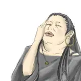
I put together the process video for the popcorn painting that I finished last month!
This was a really long and drawn out process for me, mainly because it has been a while since I added color to detailed linework. I usually go from a really loose sketch straight to color, and I wasn’t sure how to add color in a way that preserved the linework without painting over it. It was quite a struggle to be honest! At one point I spent a whole day adding detail only to find out that I preferred it more before I did that (here’s a short video showing that part of the process - https://www.tiktok.com/@loishh/video/7229755985424813338).
Nevertheless, I wanted to share the process with you! Hopefully you'll find it useful in some way.
Some info about these videos:
MORE INFO ABOUT THIS PART //
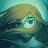
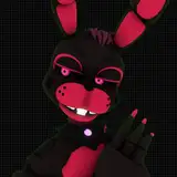
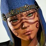
I start with adding a base color and trying to establish the general mood of the painting. I want it to be kind of gloomy and dark, so dark blue seemed like a good place to start. I wanted it to feel like there was some light coming from below, so that was my jumping off point for establishing the lighting by adding a lighter color at the bottom and using gradients to give a bit of a flowing effect! In general I always find it helpful to have one color as a starting point and kind of move out from there, using color editing tools to slowly introduce more color variation and contrast. The reason I like this workflow is because the colors are much more unified when working in this way. So you can see during this part of the process that I’m slowly introducing new colors and contrast with a lot of restraint, in order to ensure the uniformity of the color scheme!
After that it’s time to bring in some accents and brighter colors. This is something I start doing about 28 minutes in, when I start bringing in some brighter orange hues to balance out with the blue tones. Because it’s the accent color, I want there to be less of this color but for it to have extra impact, so I use it to add highlights and bright edges in some areas, especially around the hands and face. From this point forward, the painting process becomes a lot about balancing these warmer orange accents with the dark blue background.
By the end of this process video I’ve managed to find a color scheme that works for me, and my goal will be to finalize and render the painting while preserving the general colors that I’ve established here. This is going to be more of a challenge than I anticipated, and in the next part you’ll see me trying to make that work!
Yara Oliveira
2023-06-22 11:50:36 +0000 UTC